10 design inspo to steal from real Scandinavian homes

The Scandinavian design is chic, timeless and often practical too. If you are sourcing around for inspo to create your very own Scandi sanctuary, there’s no better place to get inspired than from real Scandinavian homes.
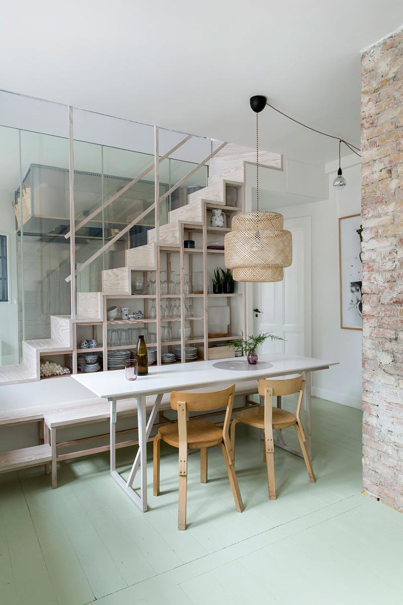
Here’s a Scandinavian lesson in curating your open shelves: stick to just a few colour palette and store like with like. Keeping things minimal, this under-the-stairs open shelving mixed transparent glassware with pretty blue and white ceramics.

Oversized mirrors were used to adorn empty walls in this Stockholm apartment. A very rental friendly option, since you won’t need to put holes in the walls. Not only do the mirrors lend a big design statement, they also help to reflect the light, brightening up the interiors.
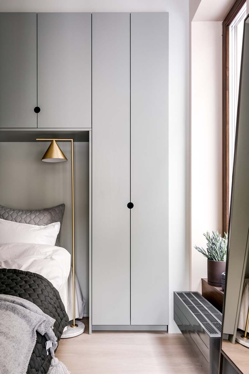
Small spaces aren’t just the purview of homes in Singapore; they are also a characteristic of many apartments in the Scandinavian cities. In this apartment’s small bedroom, the bed takes up most of the floor estate.
Entrance into the bedroom is by two sliding doors providing access on either side of the room. The wardrobe was built over the bed to maximise storage and features circular cut-outs for handles, lending a small but interesting detail to the space.

This eat-in kitchen features a mainly monochrome palette, but it doesn’t feel sterile or cold thanks to the addition of the copper pendant light hanging over the dining table. Despite being at odds with the shiny chrome of the cooker hood, it works in the space because of the similar glossy finish.
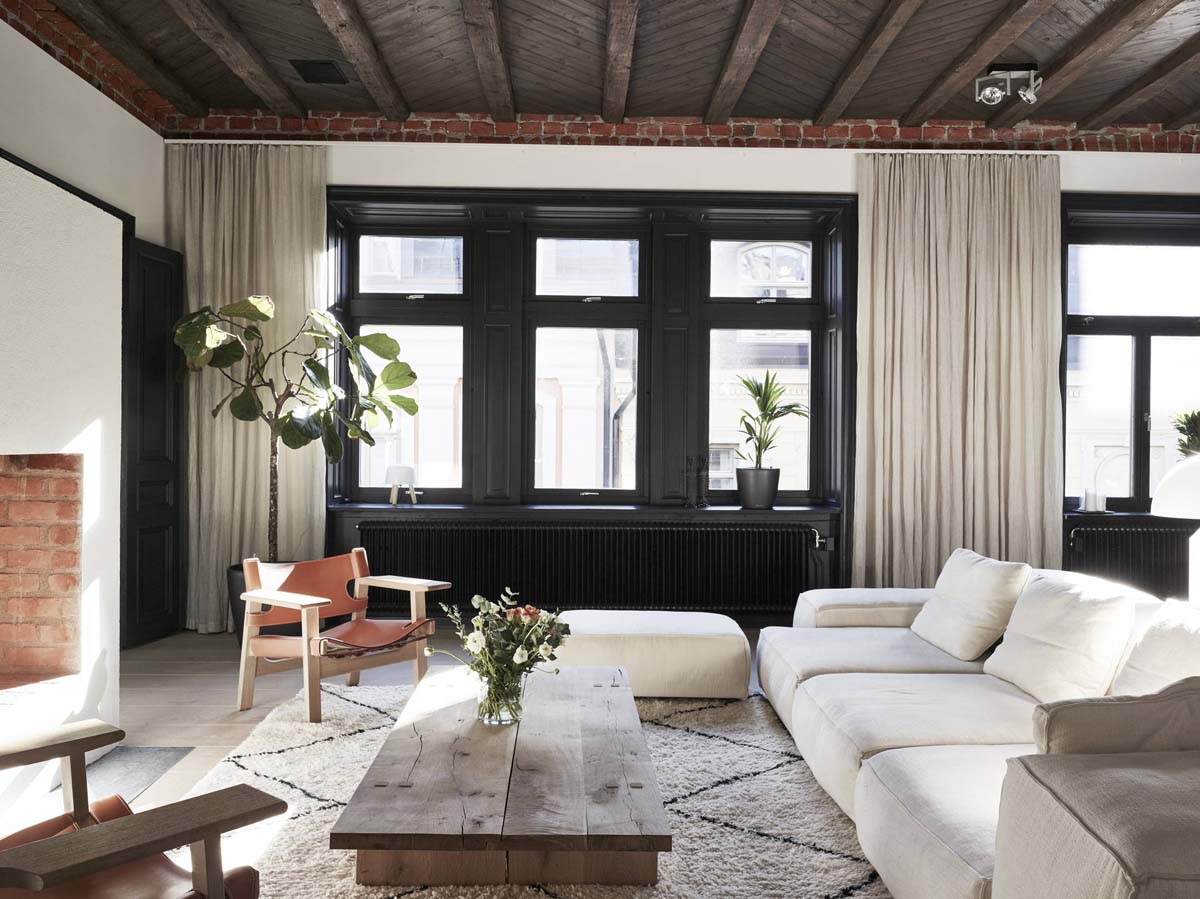
For folks with black windows, consider painting the sides of the windows the same shade of dark and keep the rest of your walls light. This accentuates your view and turns the area into a focal point. Great if you are on the fence about dark interiors but still want some drama in your home.
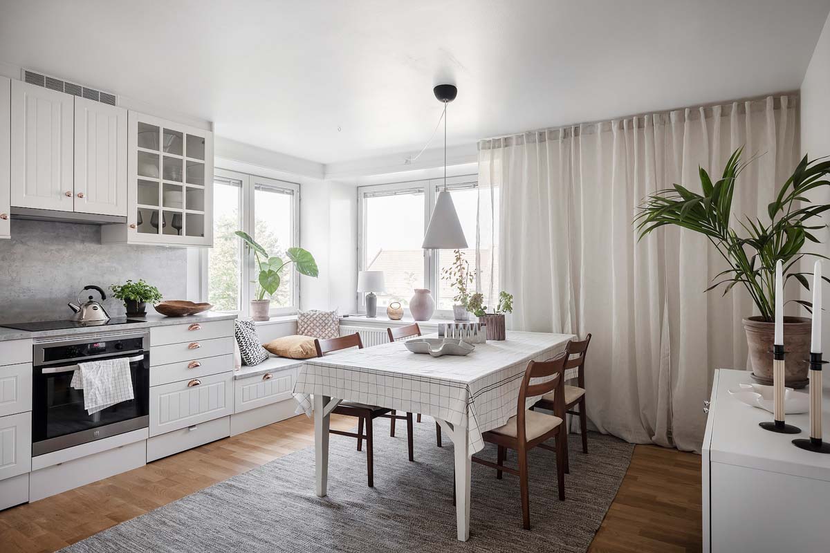
This Stockholm apartment’s kitchen features a tiny seating nook at a corner, taking advantage of the window view and the sunlight streaming in. Definitely possible in a BTO kitchen if you extend it all the way to the service yard.
Also side note: Loving the refreshing mix of open shelves and upper kitchen cabinets!

Not one to waste space, this kitchen opted for a column of pull-out drawers, which provide the perfect catchall for pantry staples as well as other odds and ends that can’t seem to fit anywhere else in the kitchen.
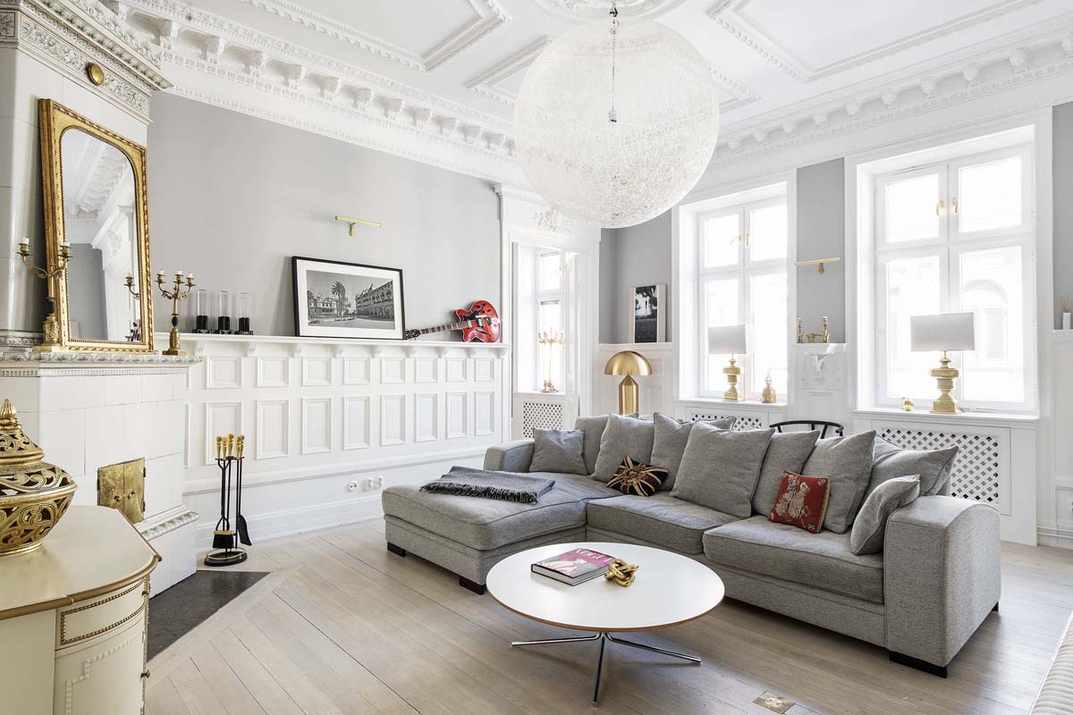
The grey and white palette here is made elegant thanks to the brass and gilded accents decked out throughout the space as well as the period features on the ceiling and the wall panelling. It doesn’t feel dated at all because the base colour and furniture choice remain modern.
Notice also the globe pendants that seem to mirror both the coffee and dining tables!
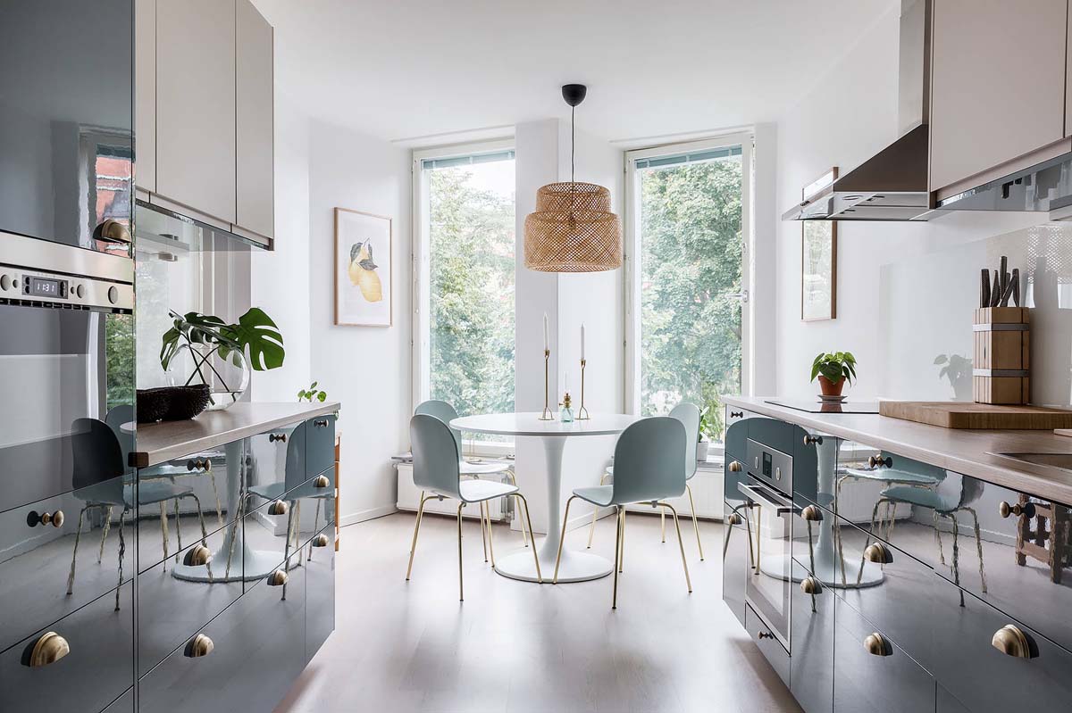
Gorgeous blue cabinets aside, check out those kitchen cabinet handles. We love that they opted to mix and match different ones, which may be a really tiny detail but makes things a lot more interesting in this space.
The same antique brass finish helps to tie things together. The pop of rattan is so unexpected in this room, but really works to lend warmth and tactility.

Chalkboard walls aren’t just for to-do lists. Add a little ledge and you can use it to put up your favourite frames and knick-knacks. Set at the back of this living room, this chalkboard display adds plenty of personality to the space.
This article was first published in Renonation.