10 good-looking kitchens in Singapore with no upper cabinet

These kitchens in Singapore show that you don’t need upper cabinets to make your kitchen look fabulous. Rather than feel incomplete, they stand out in unique ways and allow other elements in the kitchen to shine.
So you do you, and never let conventions dictate what your kitchen should or should not look like.

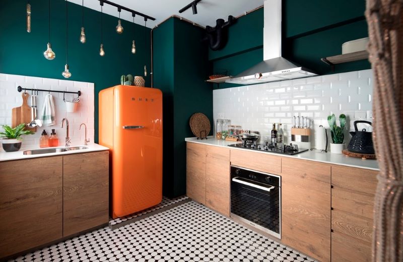
Filling the void that could have been upper cabinets with a gorgeous array of exposed light bulbs. Mood and practicality. Like the colours here in this kitchen, the choice here is vibrant and bold.

Uppers are not missed in this clean and simple kitchen. Coupled with a sleek glass backsplash and a glass divider, the all-white space feels exceptionally light and airy. Subtle marble detailing on the quartz countertop lends just enough visual interest.

Who needs upper cabinets when you’ve got such beautiful tiles to show off? This kitchen made use of two different wall tiles to keep things interesting. A mosaic type for the bottom-half of the wall and hexagon tiles for the upper half.
Open shelves—clad in the same army green hue as the cabinets—provide a natural separation between the two.

For a kitchen that reads soothing and zen, take a leaf from Japanese aesthetics like in this kitchen. A light-toned wood makes up most of the kitchen’s palette with black and white accents offering contrast without being too obtrusive.
The absence of upper cabinets makes the overall look cleaner and reduces the visual bulk in the space.
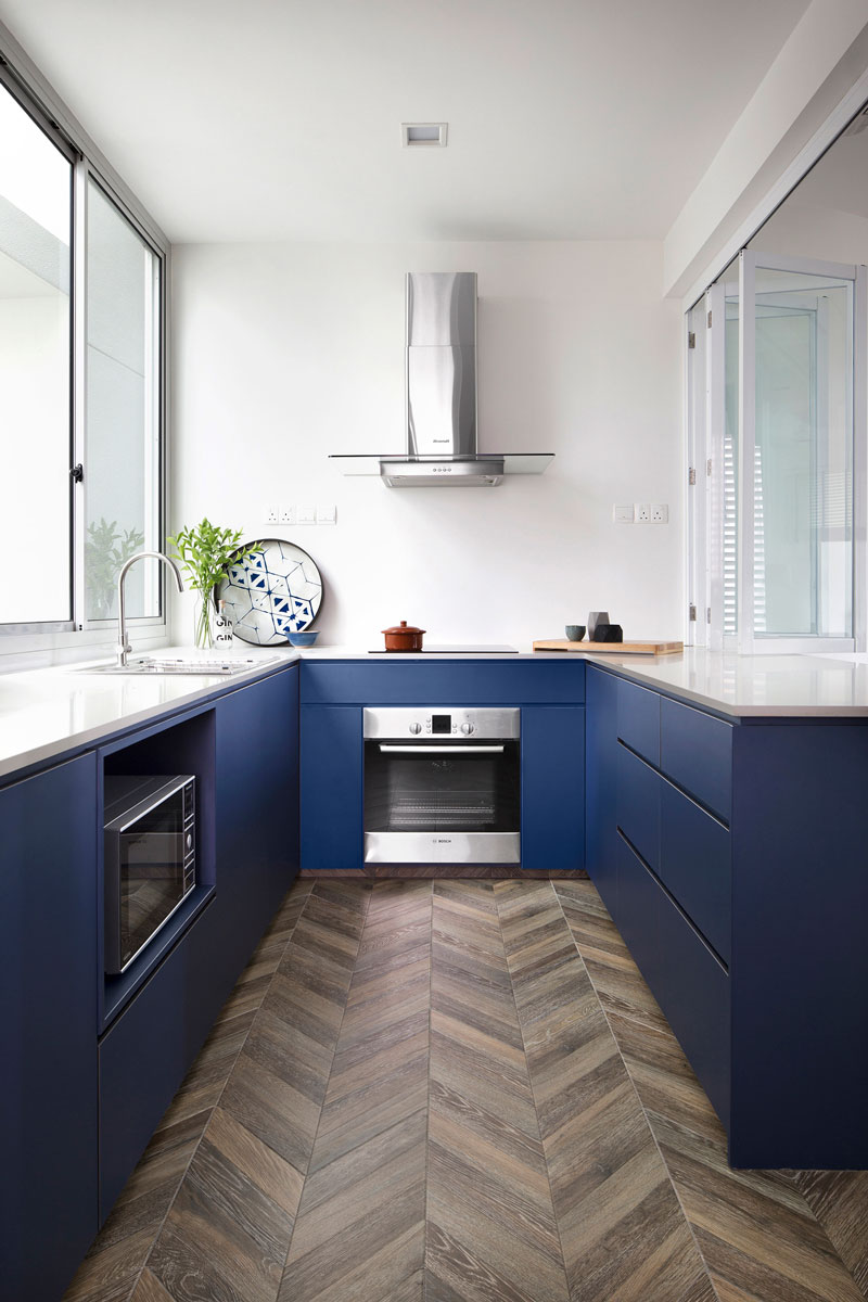
U-shaped kitchens are one of the most efficient kitchen layouts, since everything is within easy reach. But they can feel somewhat cramped, especially if you don’t have a lot of room to play around with. Removing upper cabinets, like what this kitchen did, can be useful in freeing up breathing room.

This black-and-white themed kitchen (and home!) removed the need for upper cabinets as well as a cooking hood, allowing the full-height backsplash made up of classic subway tiles to really shine through.
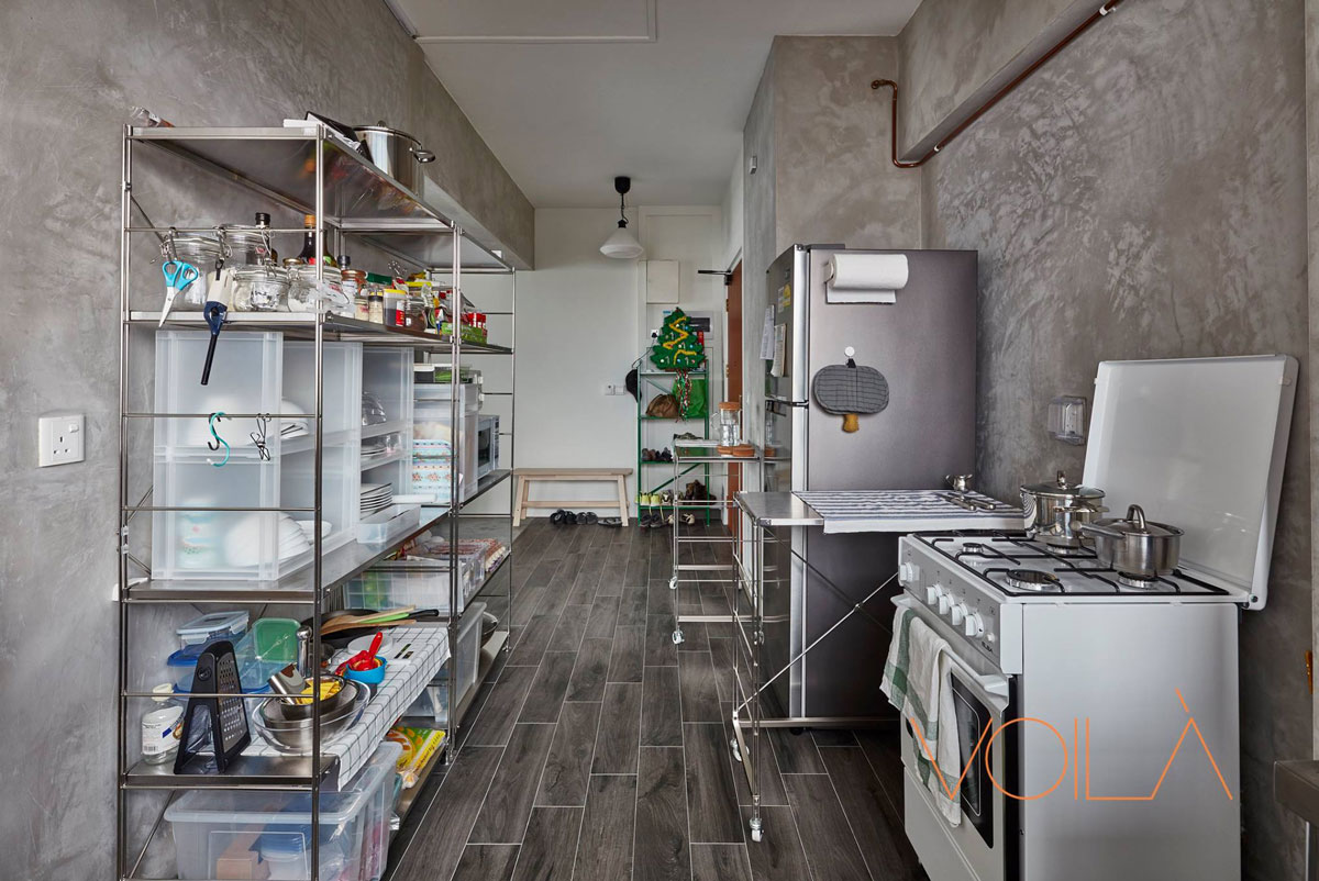
Setting conventions completely aside, this kitchen doesn’t feature any built-ins. In place of cabinets, full-height shelves were used. Not only is it a great way to save on renovation costs, it also offers a great deal of flexibility in the use of space.
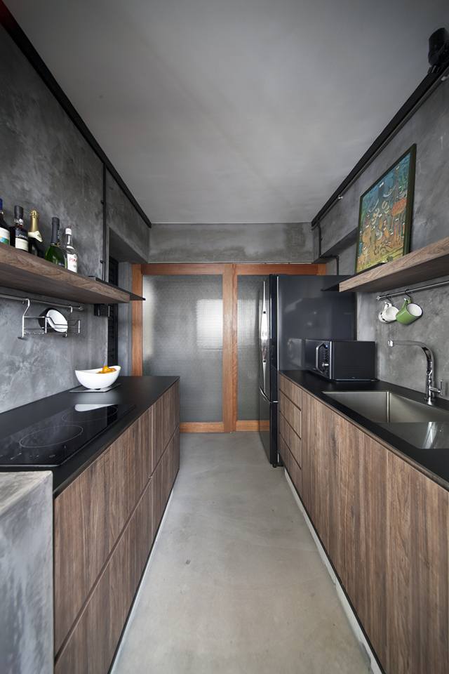
Instead of uppers, this kitchen swathed its walls in cement screed, lending plenty of industrial feels and texture to the cooking zone. Rustic woodgrain laminates covering the lower cabinets and the open shelves complement the pared-back, utilitarian look.
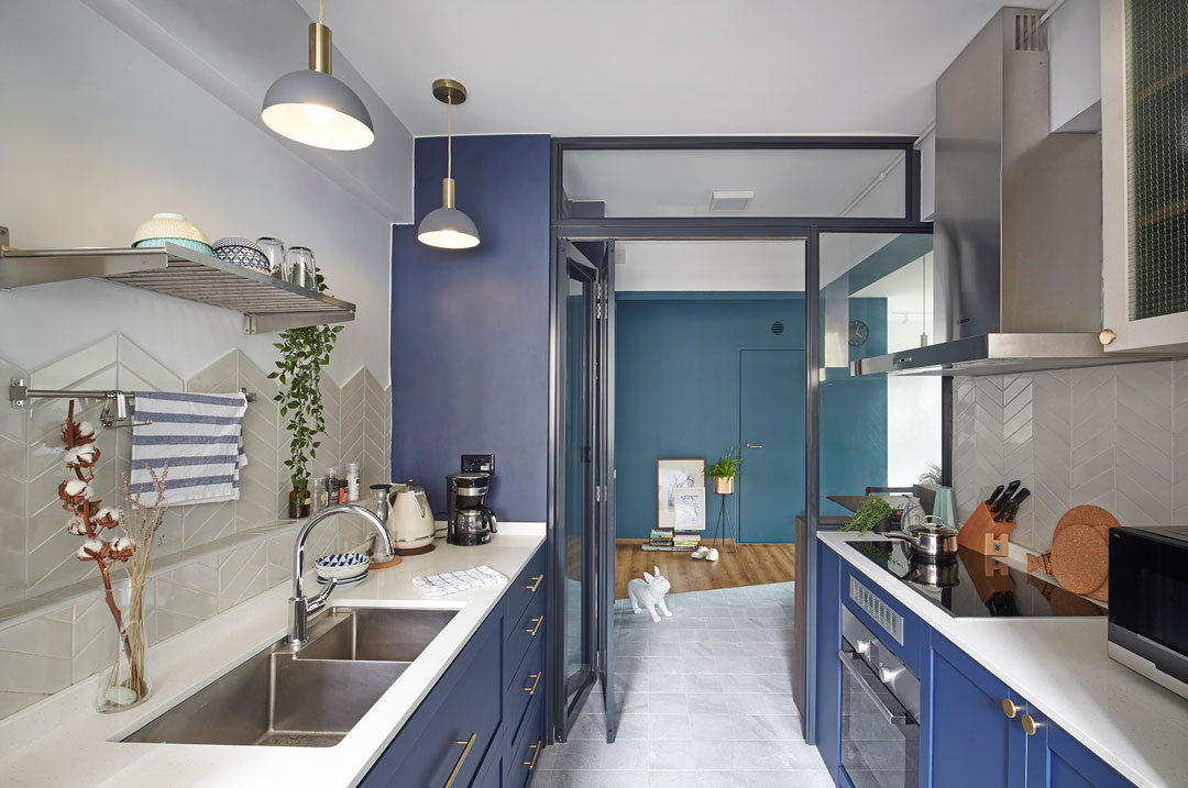
Not having upper cabinets can mean you get to showcase an interesting backsplash pattern. The chevron-patterned backsplash in this galley kitchen was made more evident thanks to the absence of uppers on one side.
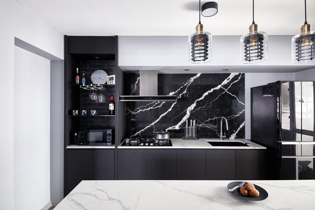
Don’t hide those marble detailing with upper cabinets if you are going with a stunning large-format tiled backsplash like this. The backsplash here makes a huge visual impact in this space, which wouldn’t be possible with upper cabinets.
This article was first published in Renonation.