9 stylish study looks to get inspired by

When it comes to offices, some key concepts are: comfortable, cosy, flexible, functional and airy. Some of the world’s best interior designers have shared with us their vision of what makes a working space eye-catching and unique.
Whether using a neutral palette based on black and white or pops of bright colour, pure lines or soft curves, made-to-measure furniture or iconic statement pieces, there are infinite possibilities. We spotted nine refreshing and inspiring examples.

SYDNEY, AUSTRALIA
INTERIOR DESIGN: GREG NATALE
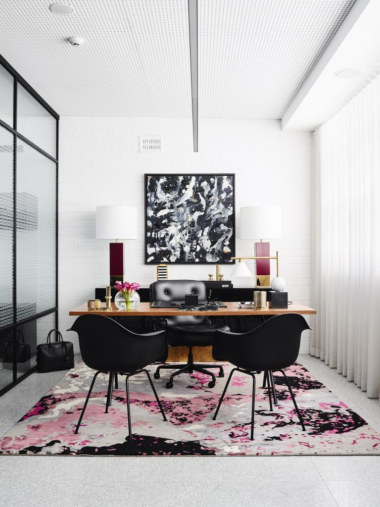
Nestled in a 1960’s building in Sydney, Australian interior designer Greg Natale’s offices are spread over three floors. “Stylistically, I have always been fascinated by Paul Rudolph’s design for the Halston house on the Upper East Side,” confesses Greg. “There was a perfect blend of public and private spaces in the building, and this was something that I wanted to explore in creating my own commercial headquarters.”
In the designer’s office, the Vapor rug, which was designed by Greg himself, was custom- coloured for this room. The Eames moulded chairs and the Eames walnut desk are from Herman Miller while the black and gold credenza is also his creation.
Decorative elements by Tom Dixon, Kelly Wearstler and Missoni Home are paired with Burgundy lamps from James Said and a painting from Scott Petrie.
“Predominately, the space works with a monochromatic base palette, over which I layered metals and pops of colour in the artworks,” Greg says. “The space is also textured with perforated ceiling panels, fluted glass and subtly patterned rugs.”

SHENZHEN, CHINA
INTERIOR DESIGN:DARIEL STUDIO
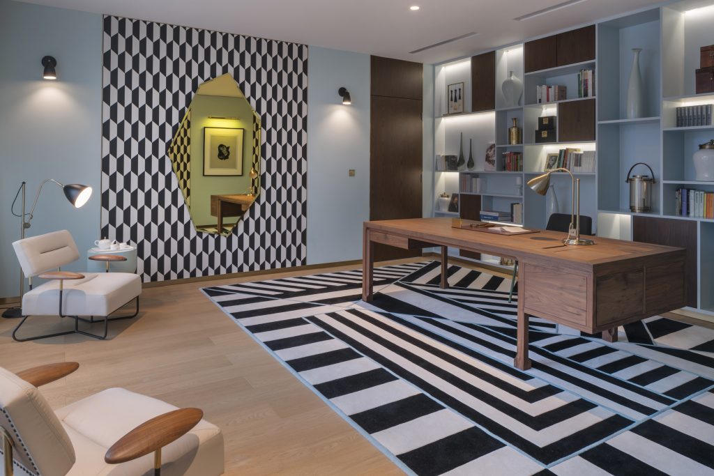
Located in the heart of Shenzhen, China, and nestled in a landscaped garden, this 9,256 sq ft top-floor luxury penthouse was designed by French designer Thomas Dariel, founder of Shanghai-based Dariel Studio, who drew inspiration from the art deco movement. “Colours, patterns, geometry and graphics are everywhere – on the walls and floors and up to rugs and furniture that have been specially designed for this project”, Thomas says.
In this office, the interior designer introduced art deco codes with a contemporary twist. “Above all things, the space ought to be inspired and inspiring”, he adds. “It features a highly cultural and artistic environment dedicated to enlightening the user who will enjoy Koloman Moser-influenced graphics, as well as pieces by surrealist artists such as Kay Sage, Francis Picabia or Ettore Sottsass.”
Through all his projects, Thomas mixes cutting-edge innovations and references from the past while giving tribute to both French and Oriental cultures.
PARIS, FRANCE
INTERIOR DESIGN: BISMUT & BISMUT ARCHITECTES
In the Sixth Arrondissement of the French capital, brothers Daniel and Michel Bismut – the duo behind Paris-based studio Bismut & Bismut Architectes – decided to transform part of the entrance to a 3,229 sq ft Haussmann apartment to enhance its function.
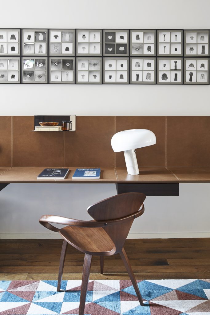
This part of the entrance, which opens up to the living room into a small study with a big leather desk, was formerly only used as a transitional space.
Known for focusing on the essentials and taking care of the volumes, lines, spaces and materials, Bismut & Bismut Architectes wanted to create rhythm and a sense of warmth in this space by adding subtle contrast and a mix of vintage and contemporary pieces.
A work by German photographer Hans-Peter Feldmann adorns the wall above the custom-made, floating desk by Bismut & Bismut. The Cherner chair (1958) by Norman Cherner and the Snoopy table lamp (1967) by Achille and Pier Giacomo Castiglioni (distributed by Flos) add a historical touch to the whole.
