How a couple achieved a Japandi look with a $90k renovation budget in an old HDB flat


If there’s anything that Singaporeans have a common love for, it’s anything Japanese. Even when it comes to a home, that minimalist Muji-look is very much a look that is sought after.
But for some, that minimalist look can be a bit too bare and cold. As such, there is a trendy look named Japandi that is a combination of “Japanese” and “Scandinavia.”
Japandi is all about combining the sleek and elegant Japanese design with Scandinavia’s modern yet warmer approach. While they may seem too contrasting, they are both rooted in minimalism and naturalness. Wood materials and neutral or muted colour palettes dominate a home’s interior.
SL and JL (@bright_hill_haus) were aiming for this type of interior for their home, and they were able to pull it off almost impeccably. Their flat, located at Sin Ming Avenue, was built almost three decades ago – in 1987.
"We bought it in 2016 after it was announced that a new MRT line, now the Thomson East Coast, will be built with the MRT entrance situated just right below the block," said SL. She added that another reason for their decision was that it's near her parents' place in Marymount.
Their Japandi-inspired home is currently occupied by just the two of them. Let's take a look at the reno journey they went through.
SL admitted that she and her husband were still naïve back then, so they initially allocated only $50K for the entire renovation. "After speaking to at least eight ID and renovation firms, we realised it was not practical considering that we wanted a complete makeover."
And so, they ended up spending around $90K for the renovation. They also had to spend an additional $40K on furniture and appliances such as air conditioners, lighting, electrical wiring, etc.
"It was the living room and kitchen that took the majority of the budget, mainly because it's the biggest area of the house," she said. These spaces required more reno work, including hacking of walls and partitioning them, creating built-in cabinets, and installing the quartz table top.
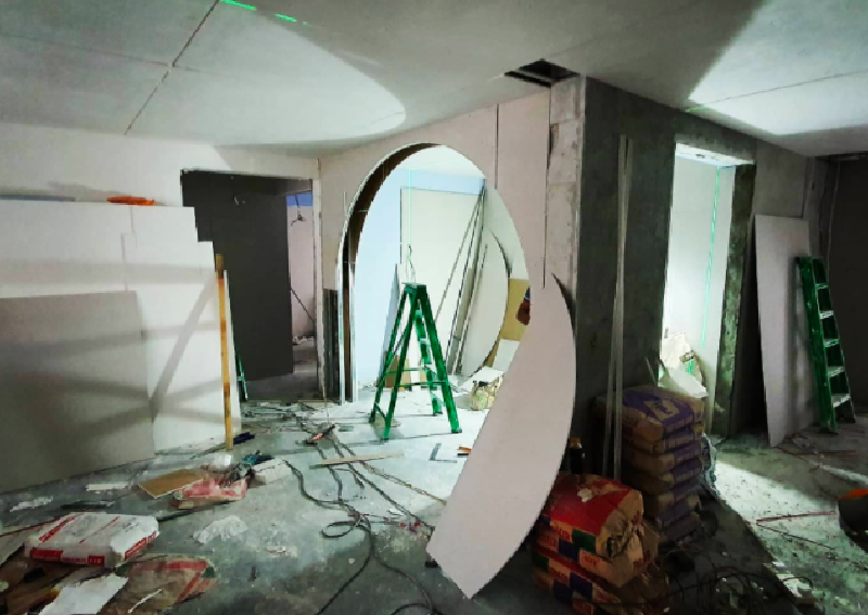
The couple already knew what they wanted but haven't really pinned it to any specific design trend. Fortunately, their ID was quite perceptive and able to translate the style they were aiming for.
"Our ID proposed a very unique design that we didn't think of," said SL. "We wanted to go with a soft muted colour scheme and something not too loud or colourful. He delivered and suggested going for Japandi." Additionally, the ID proposed incorporating curves and fluted panels to create a cohesive style.
Aside from incorporating curves and fluted panels for a cohesive style, their ID also suggested a larger living room and an open kitchen area. It coincided with what the couple wanted for their kitchen - an island table.
Compared to the original floor plan, they had to hack away almost every wall in the house.

"Our ID redesigned and did space planning for us according to our daily routine," SL said. Based on the design, they had to hack away and tear down almost every wall in the house. "All the walls in between the three rooms, storeroom, and common toilet door," she added.
Let's continue to the visual tour of how their reno journey unfolded.
The living room has a very clean look, balancing clean lines and smooth curves altogether. The muted white colour and warm wood tones make the space look elegant and peaceful at the same time.

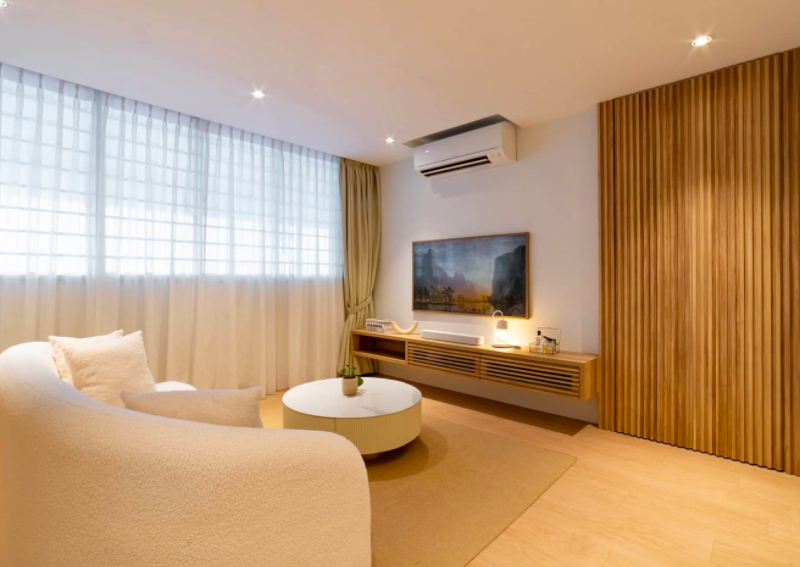
Half of what used to be bedroom number two now serves as an extension of the living room and entryway to the kitchen. You can see the opulent effect of the curved archway that the couple specifically requested (watch this video on the reasons behind our fascination with curves).
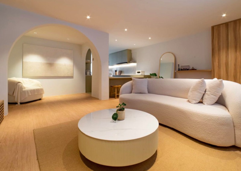
This here is a great application of an open concept kitchen. The island table creates a clear separation from the living area without obstructing the seamless flow between the three spaces. Plus, this design allows the couple to entertain their guests even while they're in the kitchen.

The combination of closed cabinetry and open shelves helps emphasise the clean lines. It also creates an illusion that makes the compact kitchen space seem bigger than it actually is.
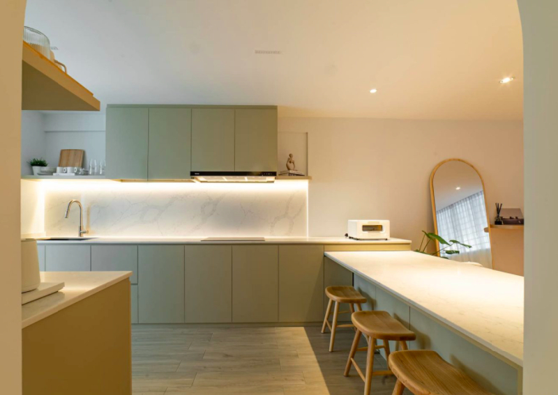
The addition of the under-the-cabinet soft lighting also really helps to set the mood of the space. Especially in an open kitchen setup like this, it's a subtle but really nice insertion.
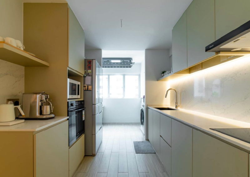
Below is the view that the couple gets to experience while prepping food and having conversations with their guests in the dining and living area at the same time.

The master bedroom retains the Japandi look with its fluted headboard and wood furnishings.


Compared to its original size, it's larger since it now includes the other half of bedroom number two SL and her husband converted this additional space into a walk-in wardrobe.

To create more space in their master bathroom, they decided to transfer the bathroom sink into the master bedroom.

While there are no wood tones here, both the master and common bathrooms were kept simple. But with appropriate lighting, still gives off an elegant feel. To make more space, they also decided to move the sink out of their common bathroom, located past the kitchen in the yard.


When we asked SL if the outcome was what they envisioned before the reno, she answered "No" - but in a good way. "In fact, it was so much better. Our ID understood our requirements and needs, and blew our minds with a design proposal no other IDs has proposed."
Their renovation contractor was Ascend Design, and it was the firm's design proposal that convinced the couple to hire them. "Their design proposal impressed us," she added.
"The other IDs suggested having the island table right in the middle of the kitchen, which will take up our master bedroom space, or having the dining table right in front of the main door." But the couple said they didn't want these design proposals.

They were able to communicate what they wanted, and their ID was able to produce a design based on the couple's preferences. "We initially wanted to combine two rooms to create a bigger master bedroom. But after discussions with our current ID, we realised that we didn't need such a big space in the master bedroom after all."
SL said she and her husband love to spend more time in the living room when hosting people. So what they really wanted was to have a larger living and kitchen area. As such, their ID suggested an open-concept kitchen. This way, they can still manage to leave at least half of the other common bedroom to expand their master bedroom.
Their ID's unique proposal was not the only reason they picked Ascend Design. "We also thought their proposed costs were reasonable, considering the amount of work that we had to do," she said.
Here's a sample of the 3D rendering that captured the couple's hearts. This render already includes other designs they wanted to add, such as the arch entryway to the kitchen.
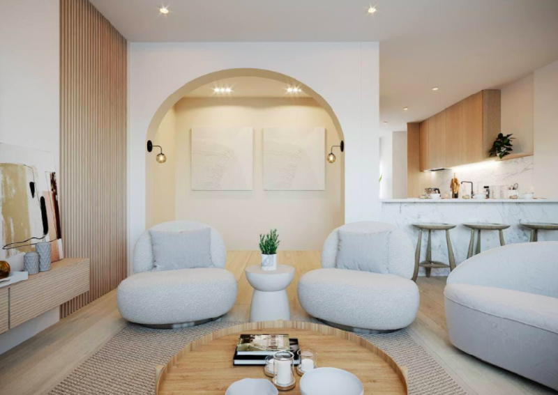
When it comes to sourcing for their furniture, SL said they were mostly from Taobao, with the exception of a few pieces that came from Blafink.
"We used the 3d rendering as a reference but it was obviously not possible to find the exact same pieces." The design was their key priority as they wanted to maintain the proposed look. Quality came second, and they relied on online reviews posted by those who purchased the items from Taobao.
SL said they did try to source furniture locally, but it was very difficult to find suitable pieces. "Most of them did not fit the style that we were looking for," she said.
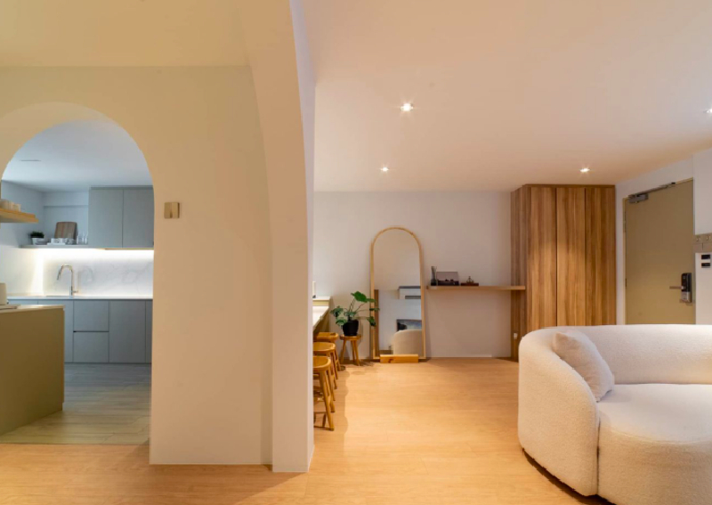
The living room and the kitchen are their favourite parts of their home. "This is the place that makes the biggest impression, and the first thing that most people see, and where we hang out most," SL added that this is also the cosiest and most spacious area.
If they were to pick the greatest challenge they encountered during the reno journey, SL said that would be pacifying their neighbours.
"As it was an extensive project, we were requested by neighbours around to stop at certain times due to their young children's sleeping time or working adults in a meeting call at home."
To overcome this, they approached some of their neighbours to understand their concerns and tried to find the best solution for both parties.
Communication was key, and they ended up agreeing on the specific timeframe when to resume the reno work. It's an underrated part of a smooth reno process, and also helps keep a good relationship with your neighbours even beyond when the works are done.

There were several mistakes that they won't be repeating. "Buy a flat with a higher ceiling," SL said. She also would make sure to reduce the size of the storeroom next time. "In hindsight, we should have done some built-in cabinets in the study, too," she added.
SL shares these two practical pieces of advice to homeowners planning to renovate their homes.
One is to visit the site regularly. The couple told us that there are several instances where it would have been too late to rectify faults if they hadn't done so.
"We noticed that some of our vendors would work beyond the allowed hours which might lead to complaints from our neighbours." She was also concerned that they might forget to switch off the lights after work.
During one of their visits, they even noticed a hole in a partition wall. "The plumber also initially installed the water heater directly above the rainfall shower which was rather unsightly. We requested the water tank closer to the window but had to replace the tiles," she added.

Her second piece of advice applies to most new homeowners who are usually very enthusiastic about their upcoming reno journey. "Keep an open mind and don't settle for the first ID you meet." Renovating a house is a significant investment, so decisions before the actual reno journey must not be rushed.
This article was first published in Stackedhomes.