Inside a Coronation Road landed home in Singapore with an incredible 7m-high family hangout space


The initial brief was seemingly simple: A house that allowed their grown-up children to have privacy and yet have sufficient space for interaction.
But sometimes, what may seem simple on the outside may not be so easy to execute.
After all, this wasn’t exactly a ground-up rebuild, but one that had to be built upon the old existing structure – an old semi-detached house with a low ceiling that was built in the 60s. Plus, it didn’t help that it was very enclosed and dark as well.
And so Diong Fuhan of Quod Architects set out to create a “house within a house” concept.
Diong said they saw the site as having lots of potential, one of which was a natural downwards slope toward the basement kitchen.
The house is situated along Coronation Road – a primary road within this landed enclave. As such, there was some distance between the site and its neighbours across the road. The highlight though, is the beautiful sculptural tree along the main road.
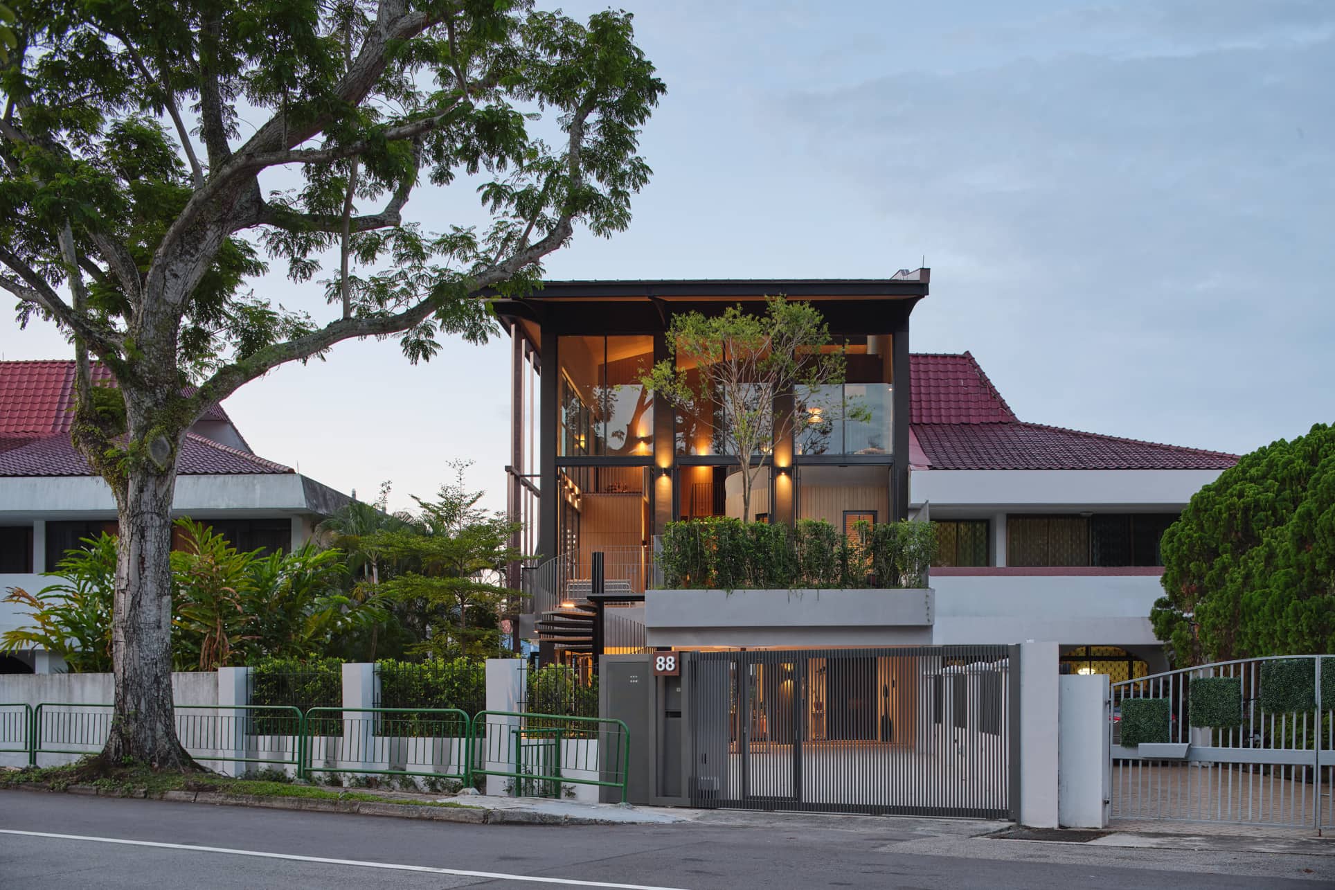
The firm’s design basically retained the original structure at the basement, first, and second storey. They also added an additional attic floor.
Let’s discover more about how the transformation happened, and how they were able to achieve the dream home for their clients.
Diong had a lot of factors to consider before arriving at the final design. She shares their brainstorming process.
“We started thinking about how a house should respond to ideal family life, including the residents’ needs and character. Also, we thought about how it should be responsive to our tropical climate.”
They didn’t want something so enclosed that would block out sunlight and retain a lot of heat. What they envisioned was a house that was open to the natural environment since the owners loved gardening. But more importantly, they also wanted to make it breezy and encourage interaction between the family members.
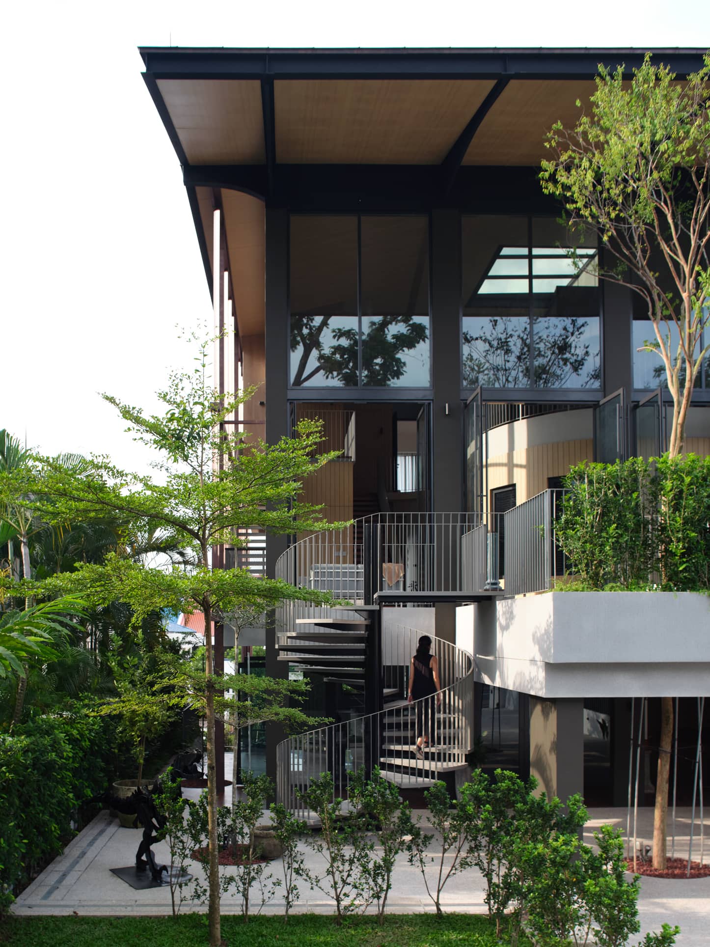
As such, they conceptualised a house that gave the residents the feeling of being outdoors. One of the methods they implemented was to maximise the common family areas. At the same time, they also wanted to provide privacy for each of the bedrooms.
“We designed a 12-metre high tree to reach from the first-storey car porch area to the second-storey terrace connected to the family area. When you’re in the family area, you can see the crown of the tree, creating an effect like you’re outdoors.”
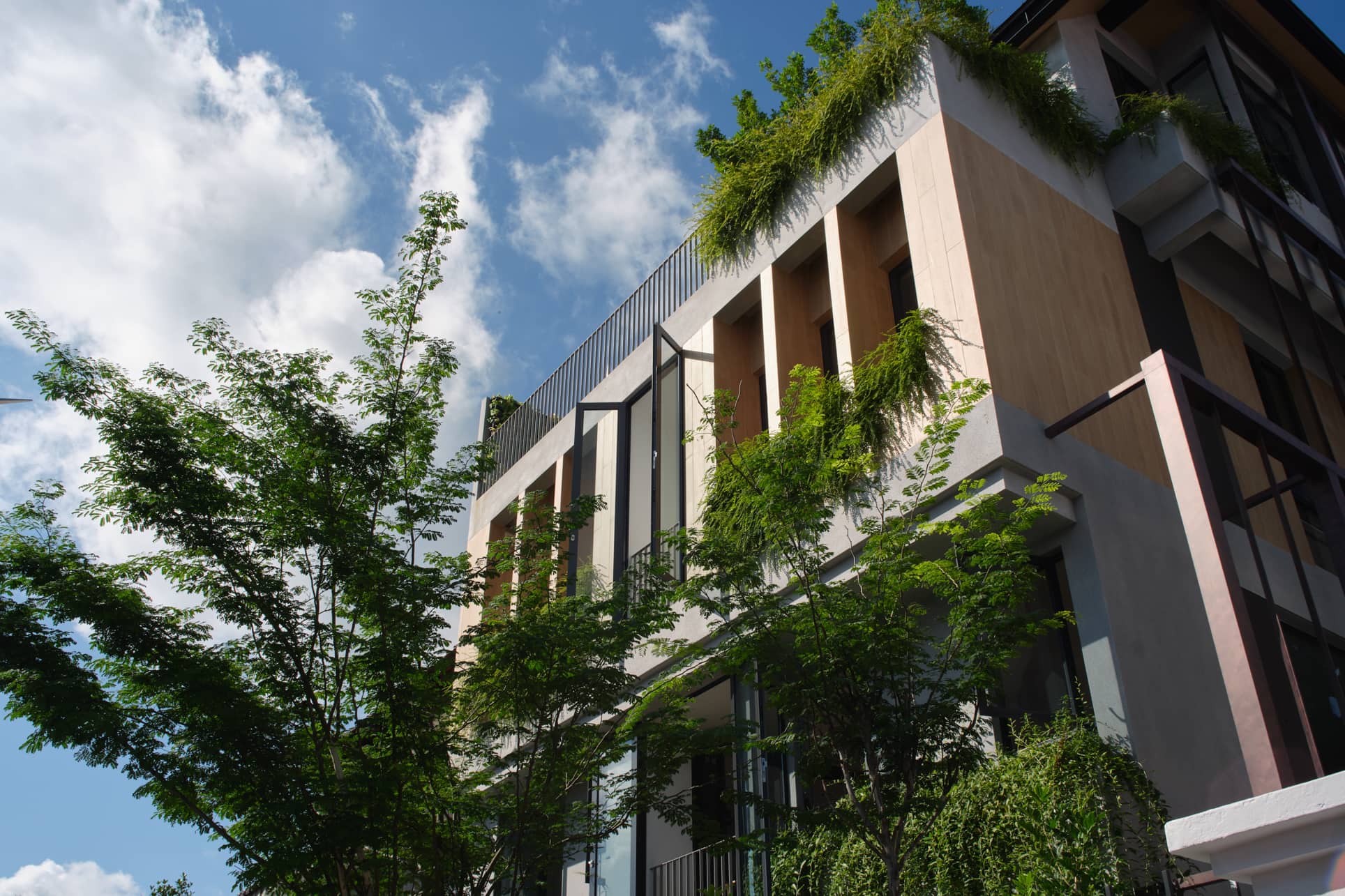
They also designed an alternative spiral staircase that you can see from the front of the house. It not only serves as a unique feature, but one that has a practical aspect too. From here, you can access the second-floor bedrooms, allowing the grown-up children to have private access. It was an added bonus that the clients really loved.
Diong and her team also used a lot of natural timber for the wall cladding in the family area. For the indoor walls, they used a rough textured paint finish.
“These are materials which are typically used outdoors,” Diong said, “but we brought it indoors to lend a touch of ruggedness. We think this resulted in a very unique architectural language.”
We asked Diong if there was anything that she had to convince the client to do. She replied that she was thankful there wasn’t much. “They took to the concept right from the start.”
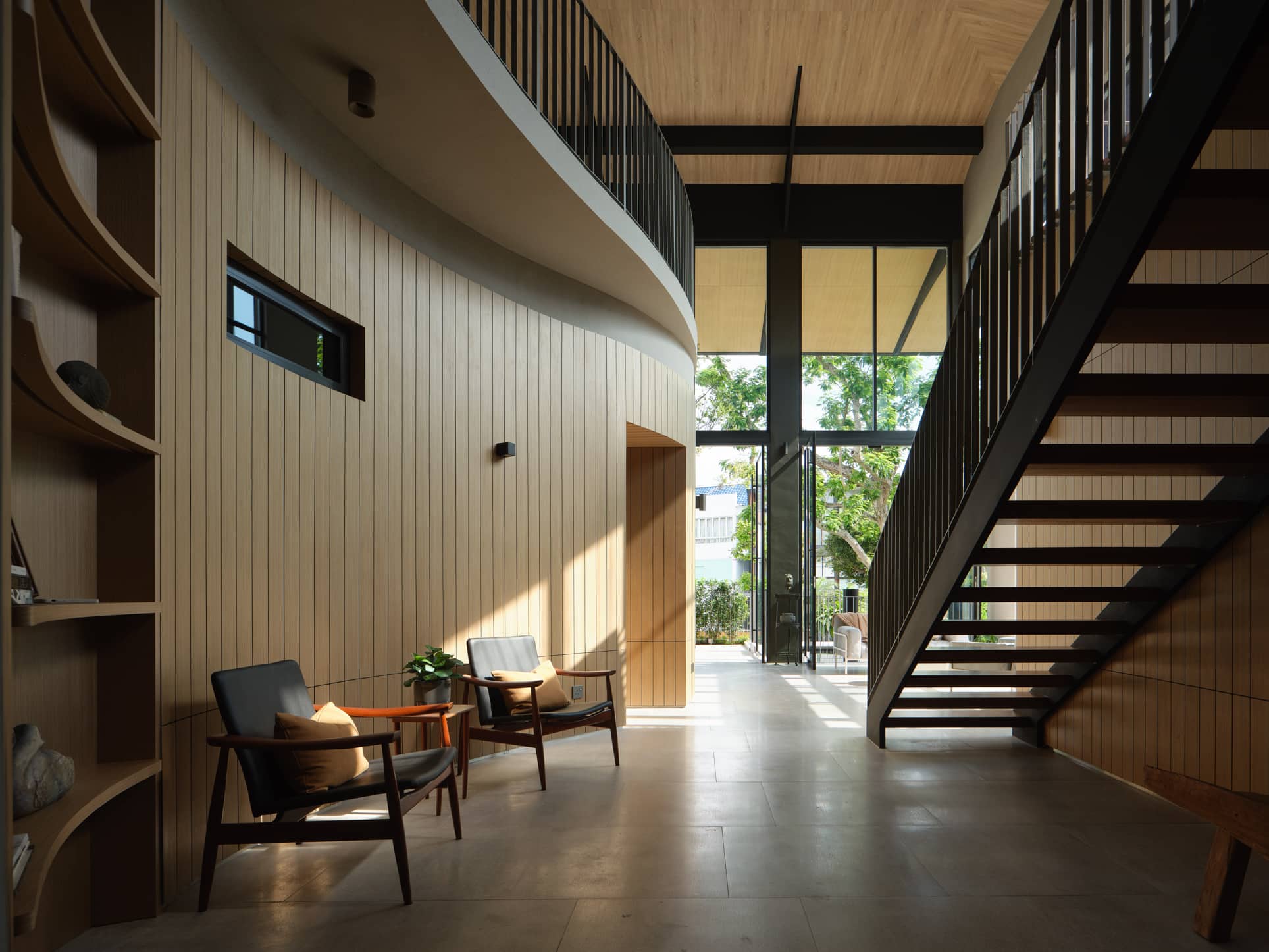
She said their most initial comments were “they didn’t imagine anything like this and loved being surprised.” The clients also liked the multiple staircases in the house.
However, the hardest thing she had to convince was about leaving the facade on the second and third storey completely open to the outdoors. She said it felt very nice and well-ventilated until the clients decided to add the glass doors.
“Fortunately, these glass doors didn’t change the look that much,” she added.
What Diong sees as a unique detail in their approach all boils down to the material they used. Instead of setting out to use only materials which are usually considered luxurious, they took another path. They used materials that are typically used outdoors, such as natural timber on walls, pebble wash on walls, and texture paints.
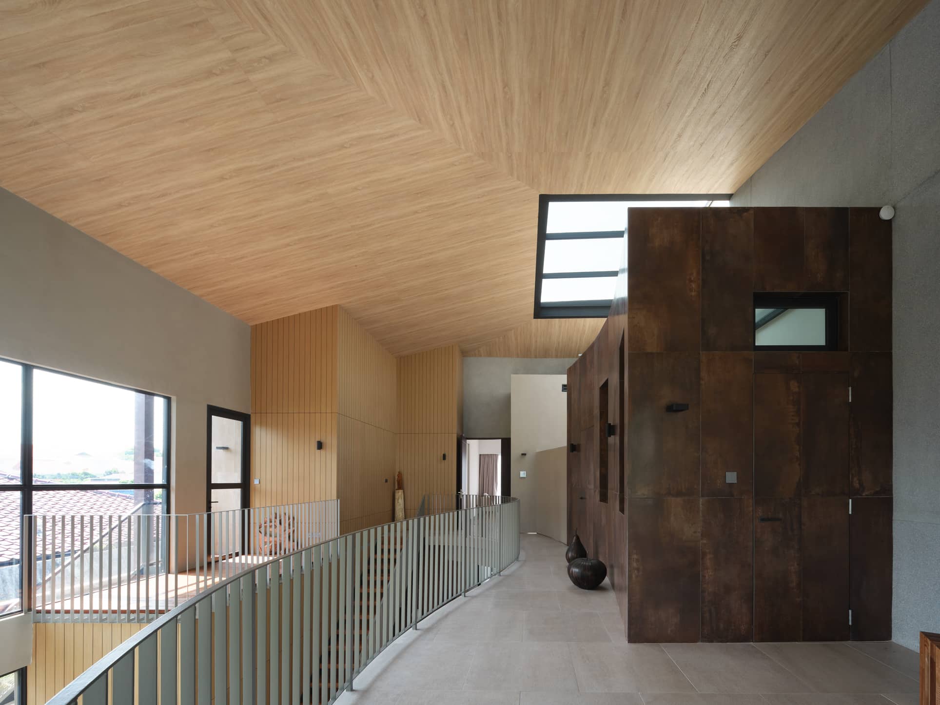
Their team did not have to make major structural changes to the home’s original layout to bring their design to reality. “We retained the structure of the basement, first, and the second storey of the original house. However, we added another floor above.”
They deemed the original design not suitable for contemporary living. It was enclosed and dark, with few windows. The ceiling height was also low, and the kitchen and dining areas were on separate floors, which didn’t make much sense.
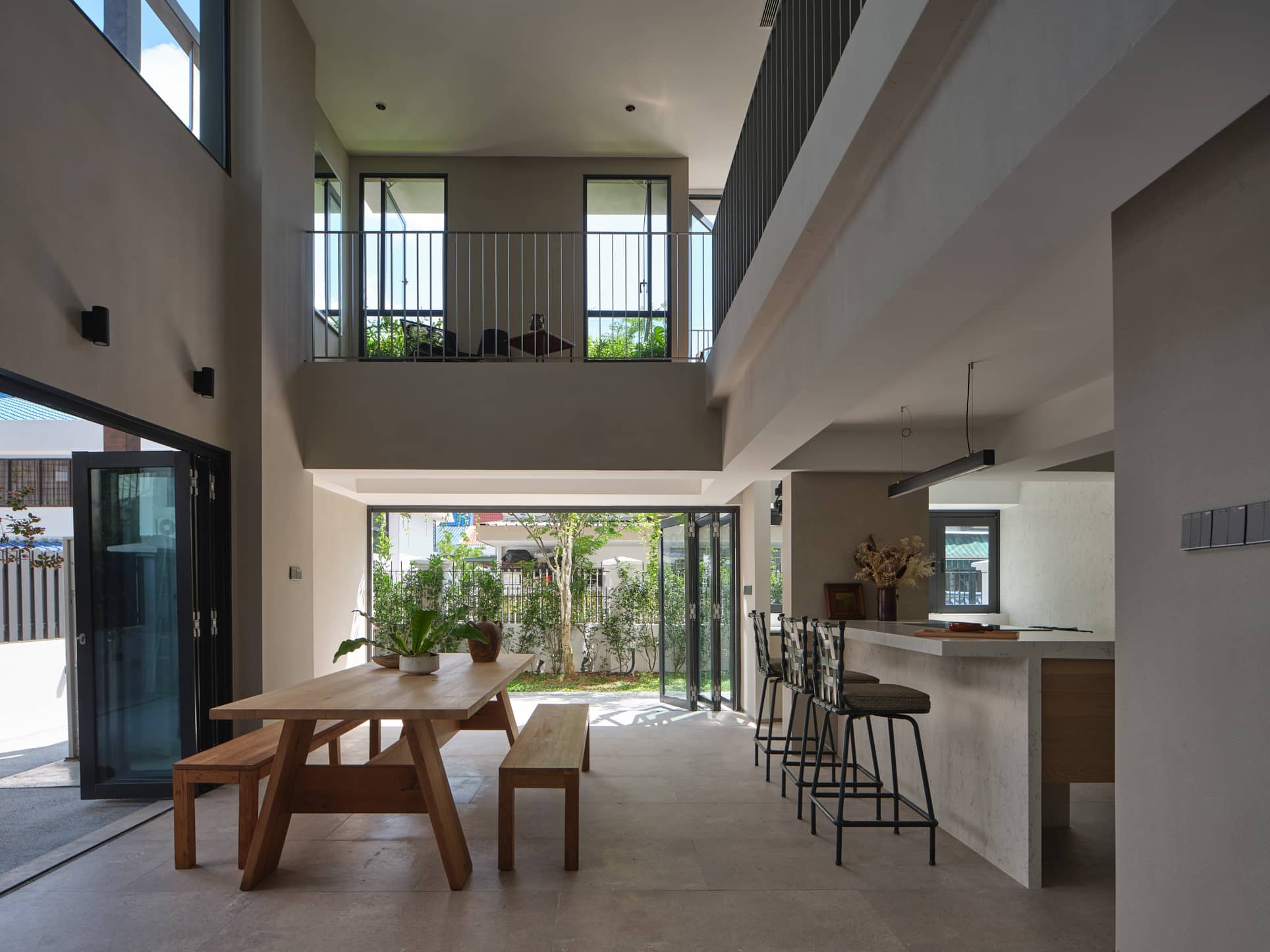
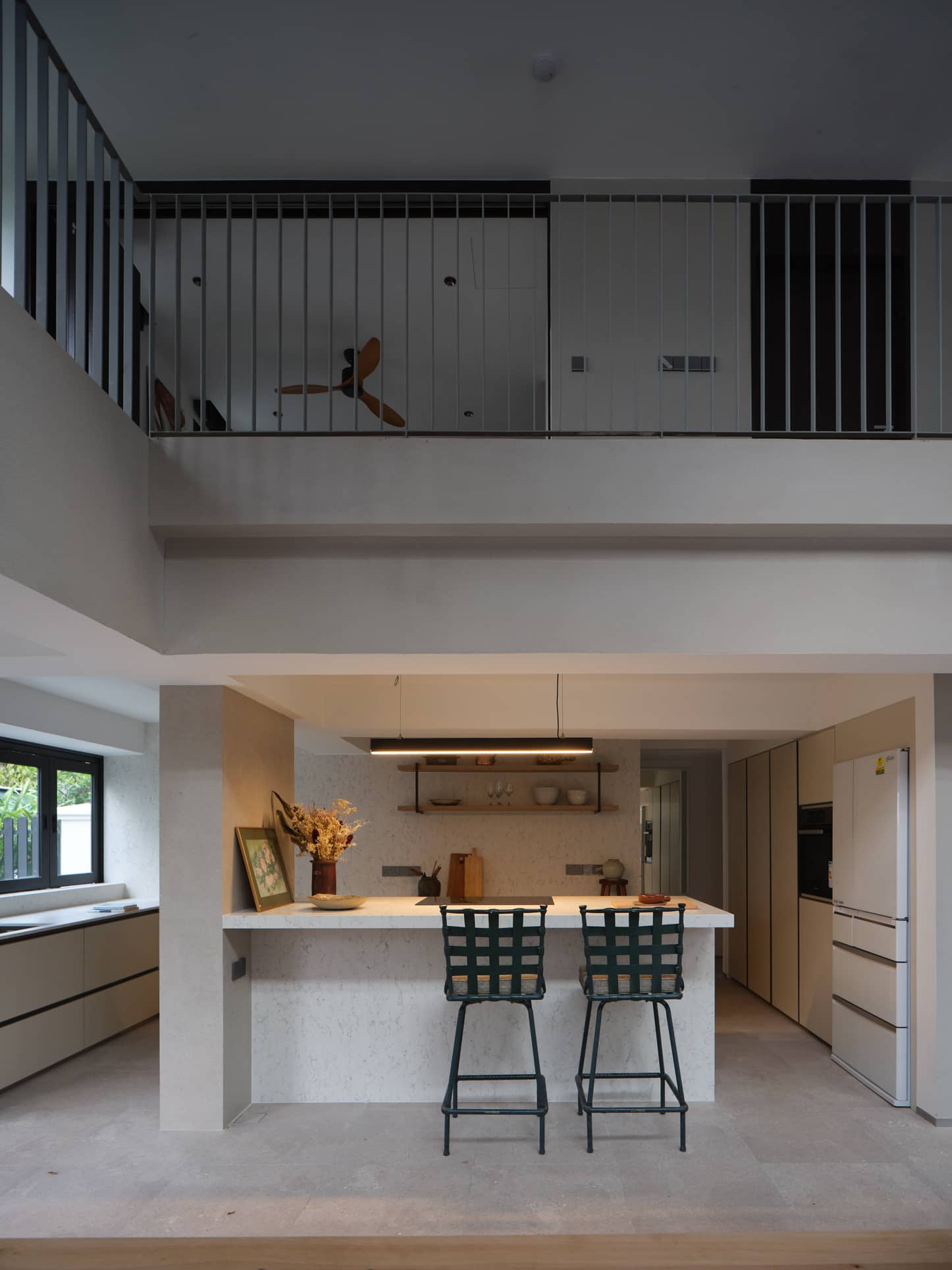
To rectify this, they created a double-volume dining area next to the basement level kitchen. This allowed for a wide and grand staircase from the ground-level living room. The result? A lot of cross ventilation, making the home feel more spacious and delightful.
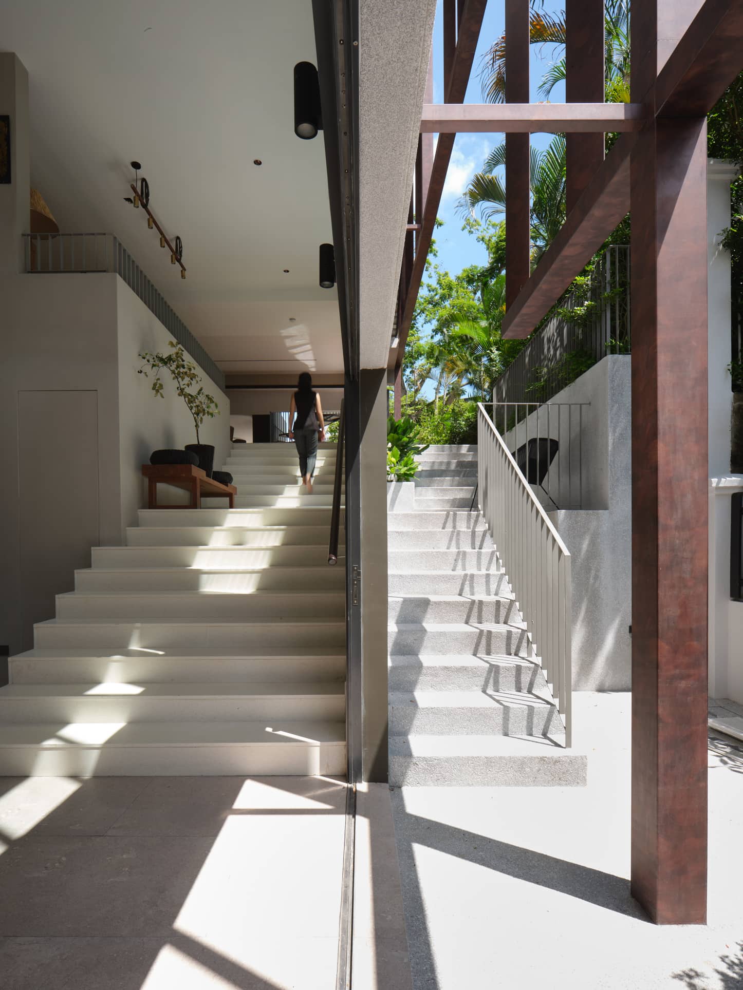
In fact, the grand staircase became not just a circulation space but also a gathering space where one can sit and socialise when there are large gatherings.
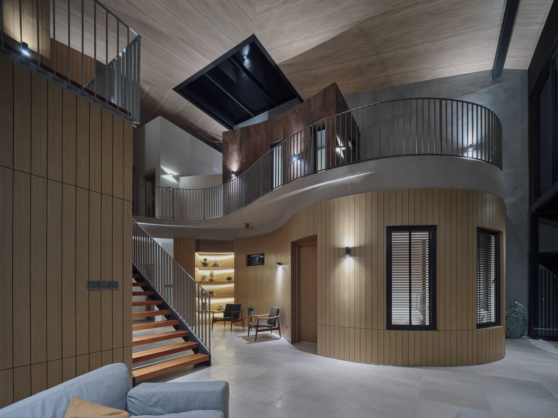
The second and third storey is where the more private space is, such as the family areas and the bedrooms. There’s the main staircase which leads from a family area to the internal balcony. They wanted their clients to feel like they were moving outdoors when they were using the staircase, blurring the boundaries between inside and outside.
Here’s what they’ve done to each room in detail:
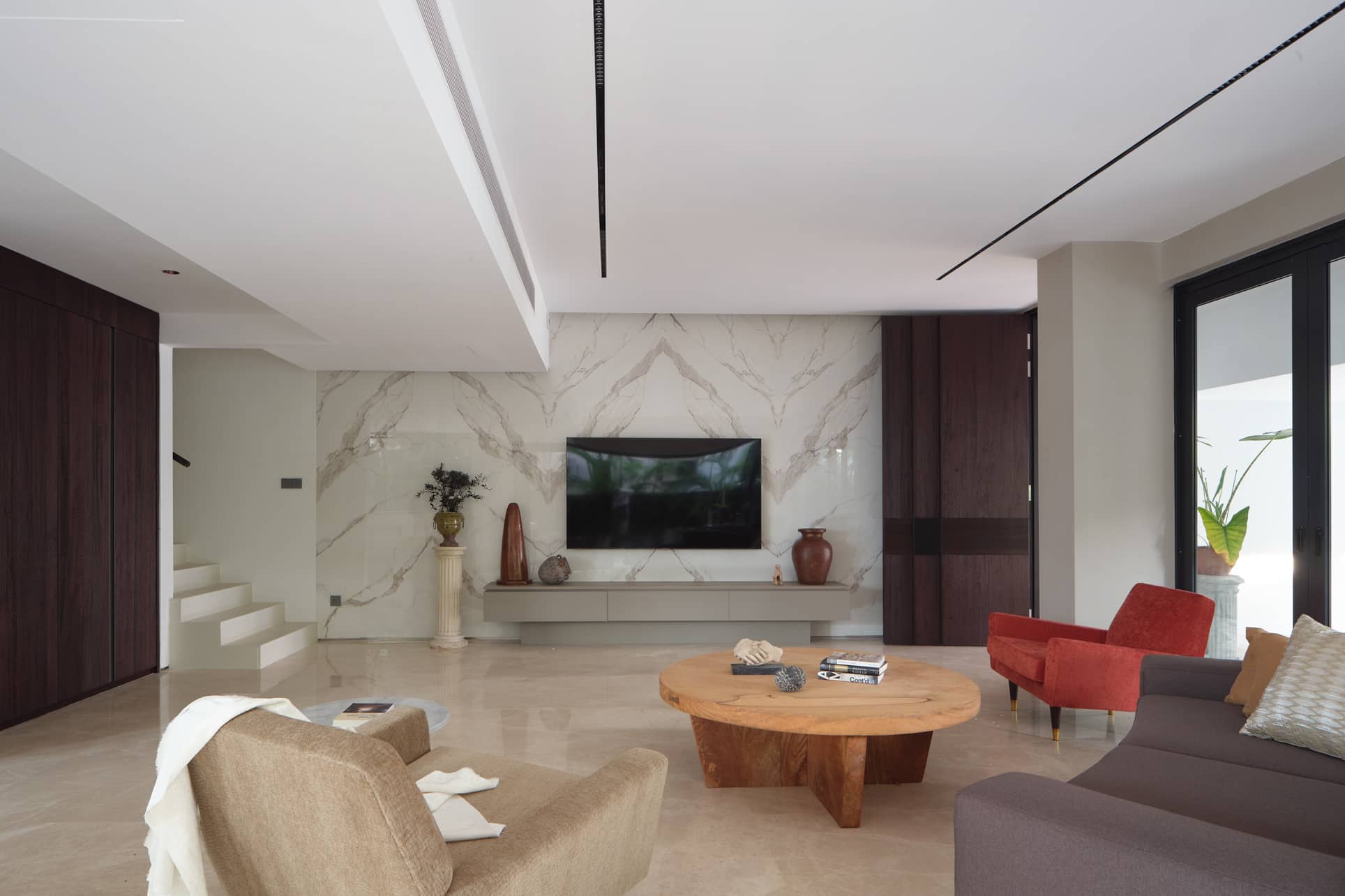
Diong’s team retained the living room location as well as the ceiling height. They changed the floor finishes to polished crema Marfil marble, while they cladded the features walls with full-height marble.
The use of these luxurious materials made the living room look more polished and refined. “This is probably the only space in the house where we used materials which are conventionally considered luxurious,” Diong added.
Diong said that they hacked the 1st storey slab to allow for a double-volume dining space, which sits right next to the kitchen area. The basement dining area looks out to the rear garden, effectively creating a casual tropical setting.
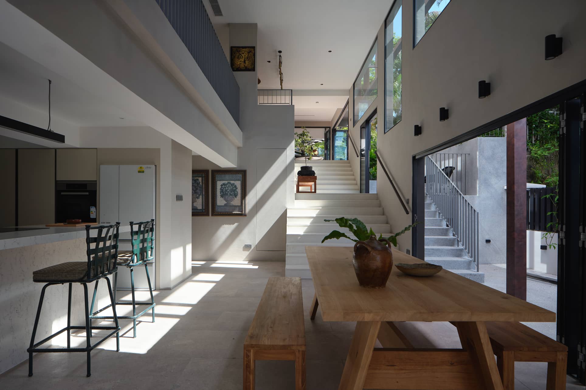
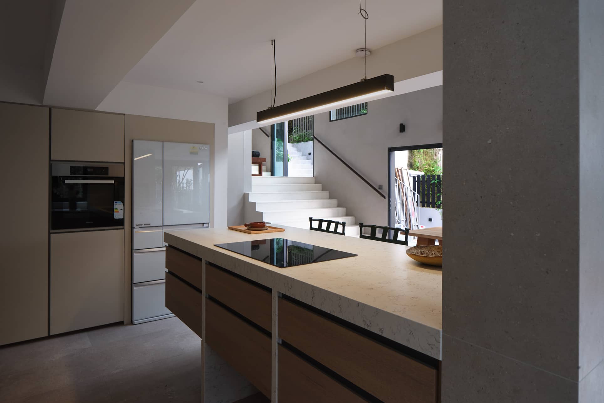
The kitchen area is already quite spacious as it is and well ventilated. It also has a good view of the rear garden. That’s why Diong said they didn’t design for any overhead top cabinets so that the area feels more spacious and less cluttered. Instead, they added lots of full-height cabinetry for storage. They also cladded the island with Italian Silestone for an understated matte look.
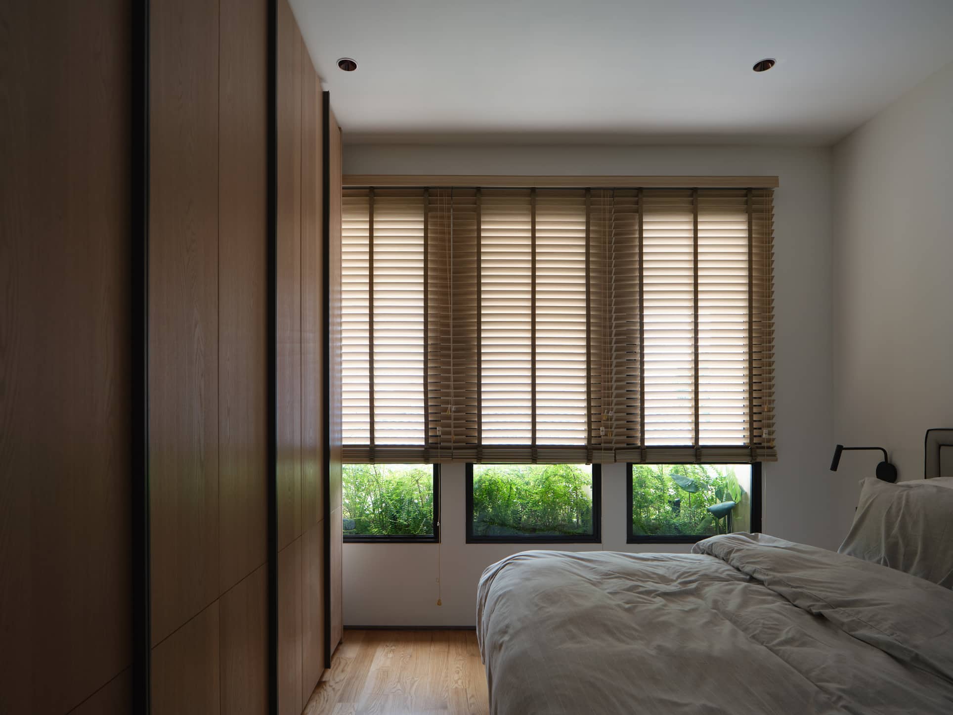
The common bedrooms were all designed for each resident in mind, having their own unique spatial character. Given that the bedrooms at the rear are closer to the neighbours at the back, they added planters for privacy and a pleasant view.
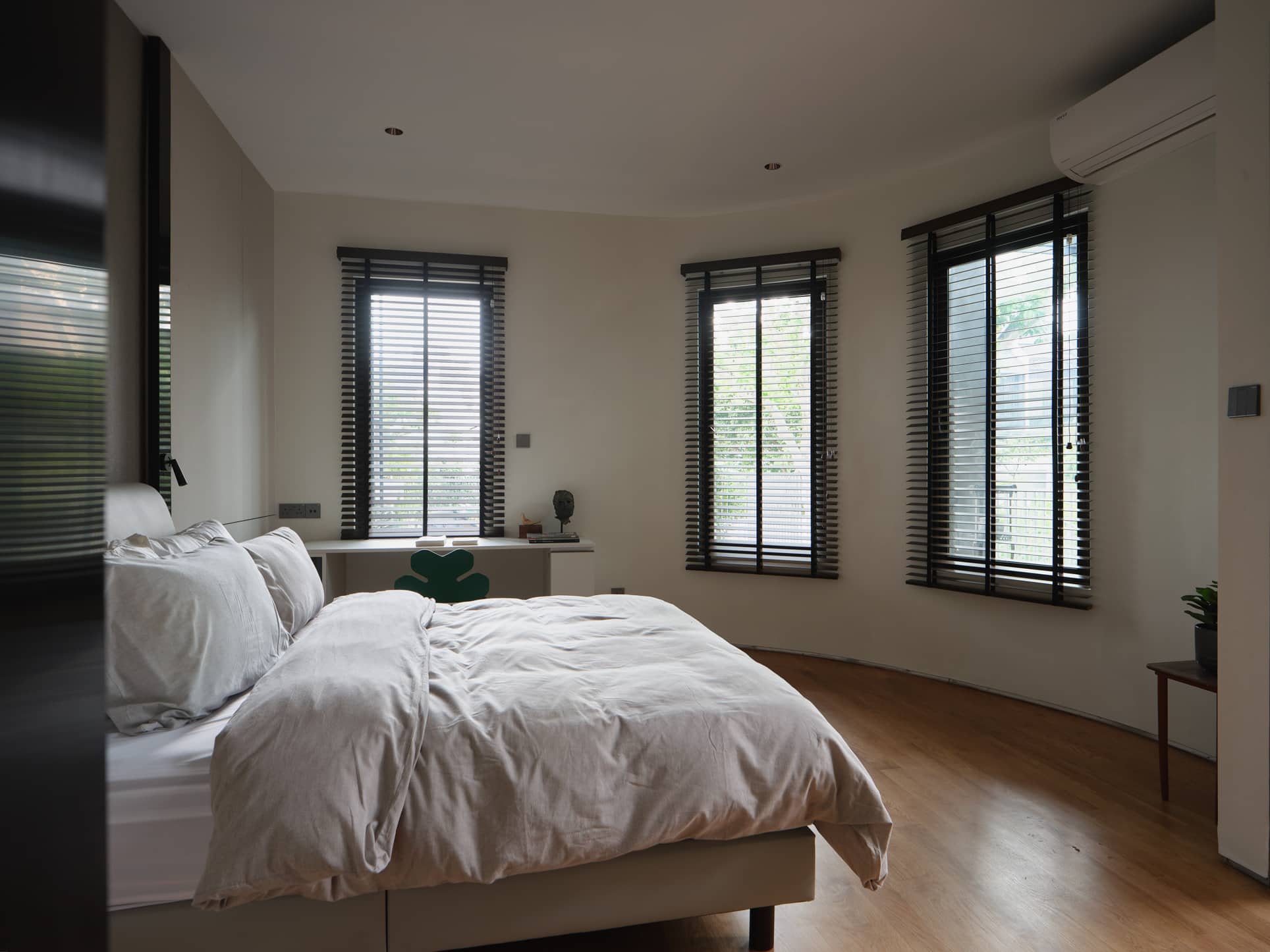
The junior master bedroom faces the family area on the second story with a view of the outdoor terrace. For the other two common bedrooms, they followed the clients’ request for a walk-in wardrobe and study loft, respectively. The curved nature of the walls creates a visually interesting space, which works well because of the size of the room too.
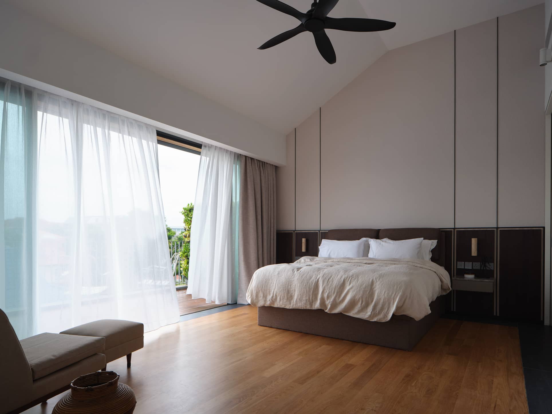
The master bedroom is on the top floor and enjoys views of the low-density neighbourhood. The space was big enough that they were able to compartmentalise different functions, with an adjoining study room and a large bathroom connected to the walk-in wardrobe.
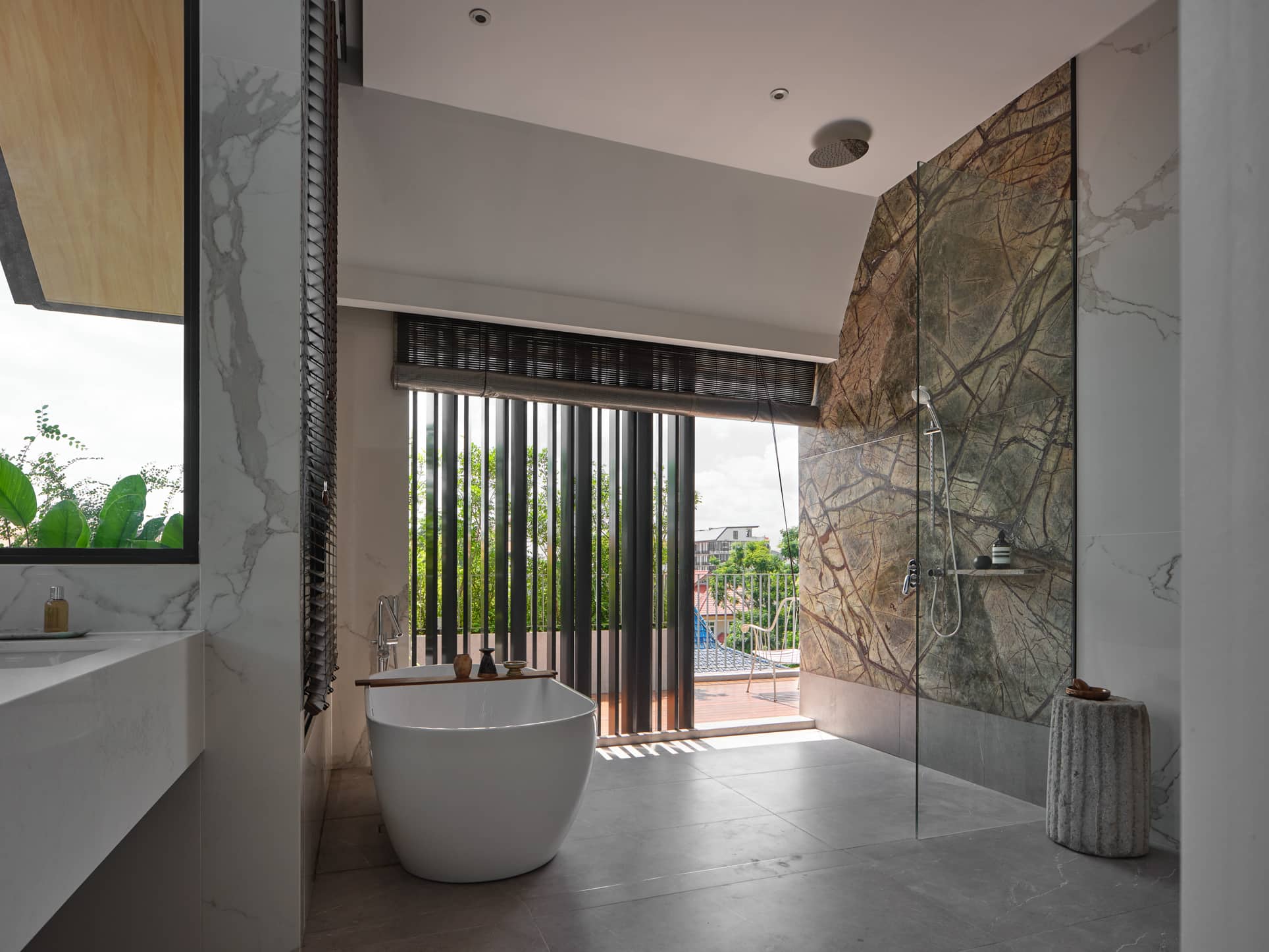
Since the master bathroom is quite spacious, they were able to install a luxurious double sink and a standalone bathtub. They also designed the bathroom to be quite open to the balcony with a combination of screens, planters, and blinds for privacy.
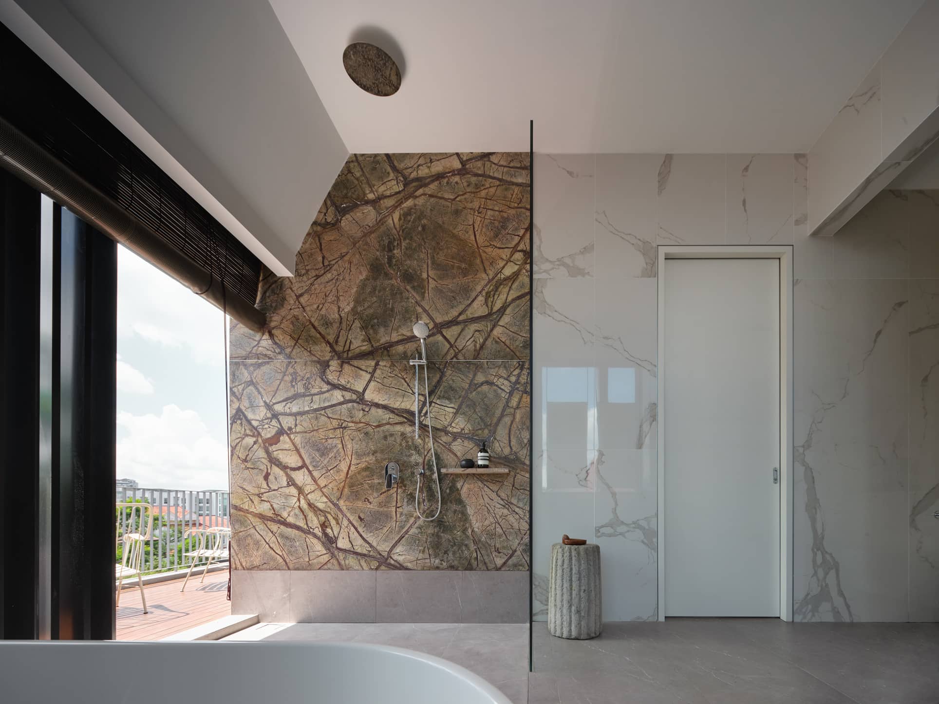
In line with this outdoor theme, they also used green rainforest stone in leathered finish for the shower area feature wall. It’s a really contrasting look as the rainforest stone looks like the bark of an ancient tree.
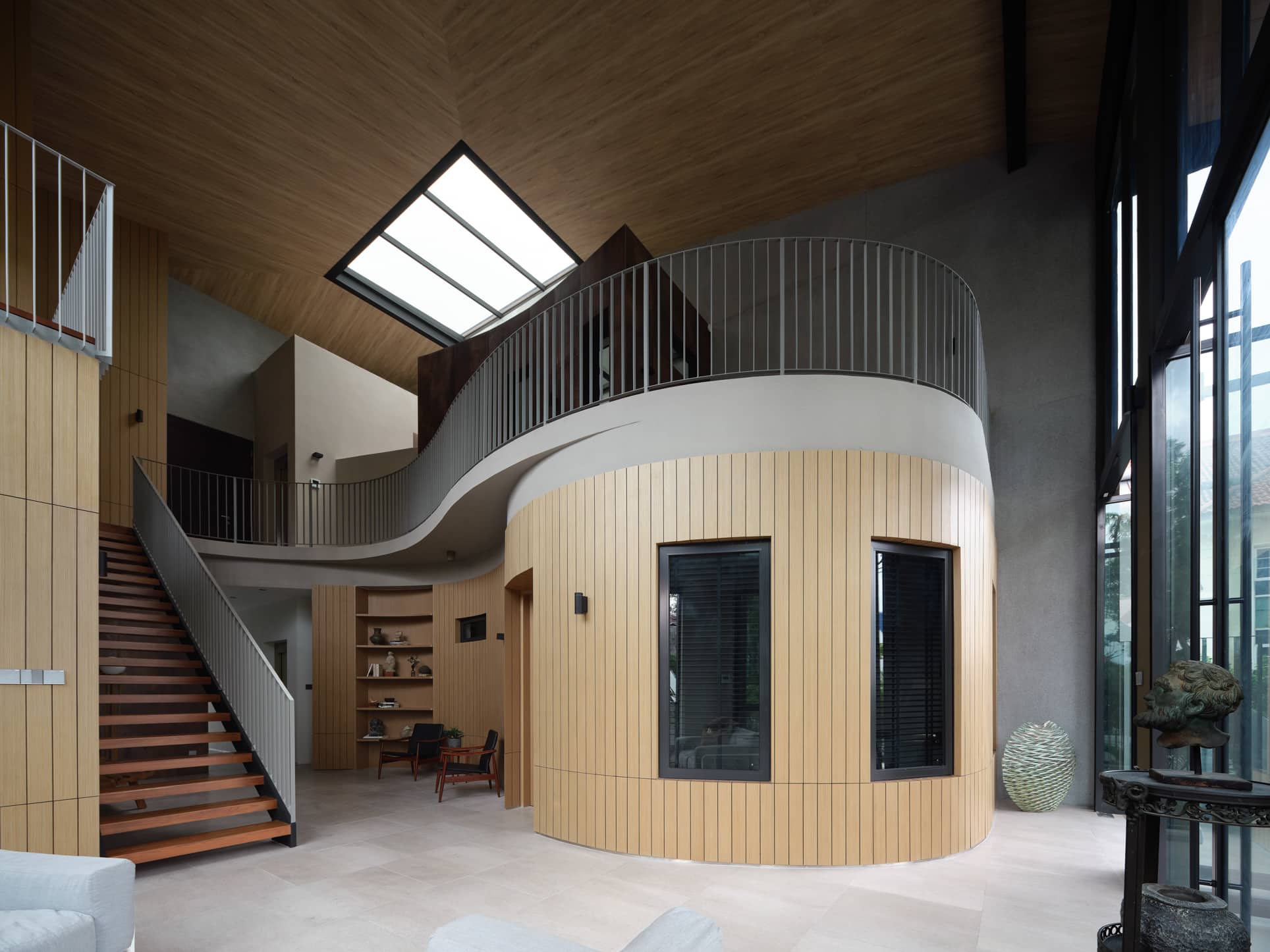
This is what Diong considers to be the highlight of the entire house. The family area features a double volume ceiling which is almost seven metres high.
They covered the ceiling and curved feature walls in natural timber, while the same floor finishes extend to the outdoor terrace, which visually would increase your perception of the space. When the facade doors are open, the design creates seamless space, blurring the separation between indoors and outdoors.
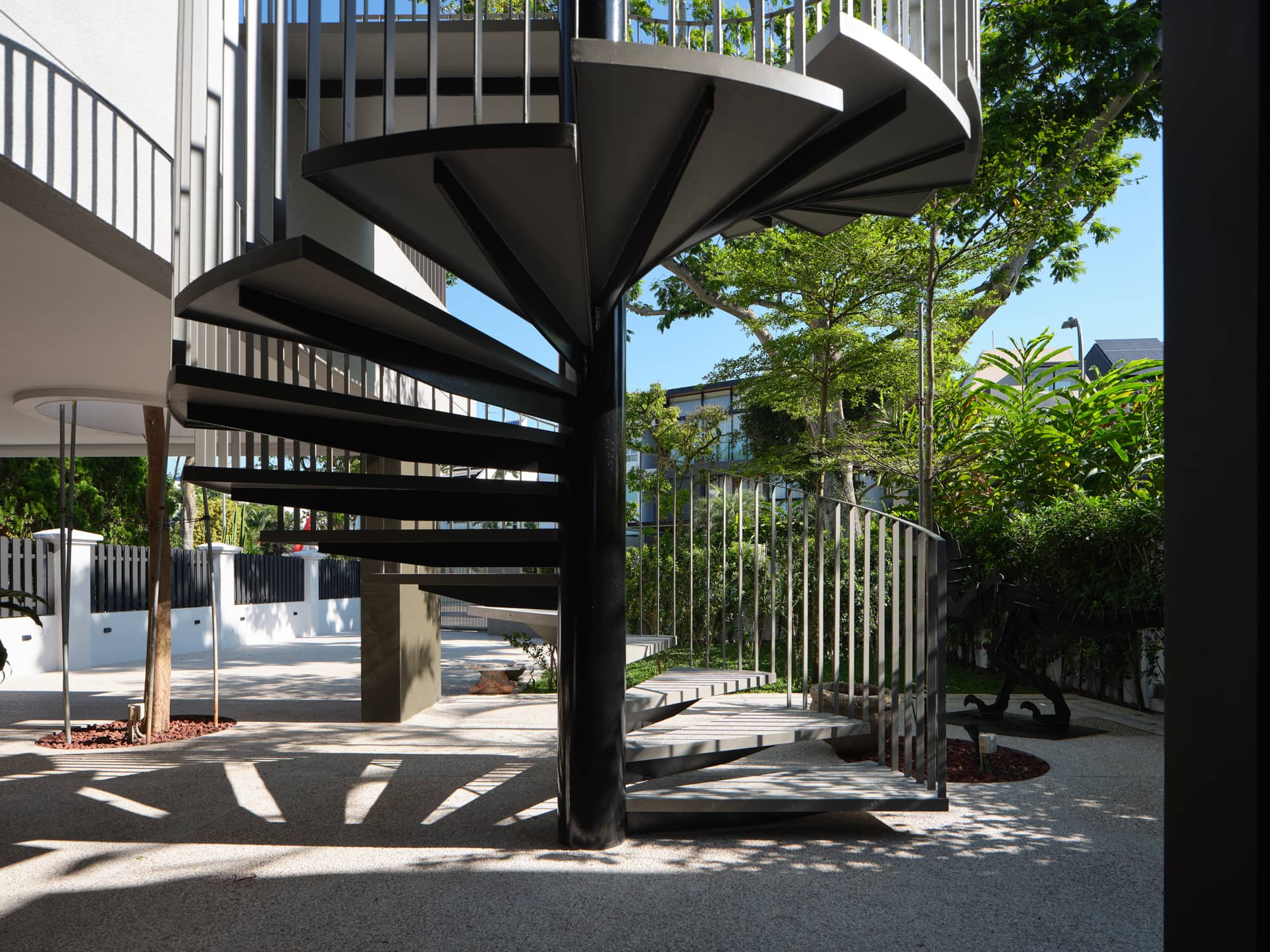
The terrace is accessible from the ground floor using the spiral staircase. This staircase – covered in Serrizo grey granite leather finish – adds a sculptural element to the facade.
We asked Diong what their clients’ reactions were after they completed the project. “Actually, they think it’s better than they envisioned it to be. Being in it and feeling the space is definitely better than seeing it on paper.”
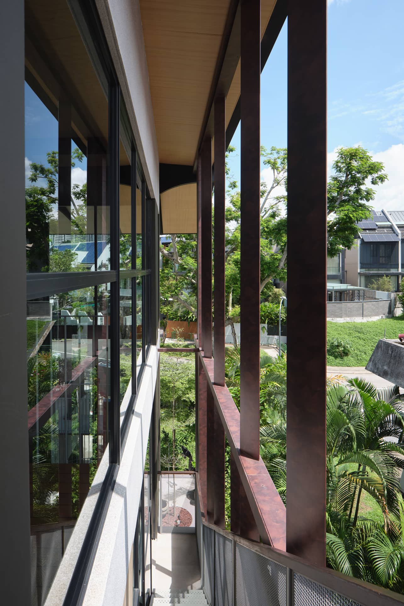
Their team encountered one major change to the design along the way, though. Diong said that the second and third storey of the house was originally designed to be completely open without enclosure on the facade.
“We had run the design through environmental simulation studies, and it showed that the roof overhang was sufficient to prevent wind-driven rain.”
However, the clients were afraid that it would invite birds and wildlife into the house. So Diong’s team added glass doors to the facade. “We still think it would have been cooler if there were no enclosure, but the current design is not that huge of a deviation from the original intent,” she said.

Even with a team of experienced professionals, everyone had to endure the effects brought about by Covid-19. Like many other construction projects during the last two years, this one was brought to a standstill for months at the onset of the pandemic. When work resumed, their progress was also slow due to labour shortages.
Sometimes in a project, there are design compromises that need to take place to accommodate the family’s lifestyle or Singapore’s tropical conditions. Diong said her clients had to sacrifice maximising the utilisation of the entire area to make it ideal for the country’s climate.
It’s natural for homeowners to want to maximise the property’s buildable area, especially since land is scarce in Singapore. However, sometimes allowing for double volume spaces and cross ventilation means some areas have to be sacrificed for a more liveable environment.
We asked Diong what she thinks is the best area of the home. “My favourite part of the house is definitely the second-storey family area. It is very open. It feels like you are outdoor even though you are resting comfortably in a sheltered space.”

Indeed, the family area offers views of the terrace, the front garden area, the huge tree along the main road, and the internal balcony on the attic floor. Diong remarked that he would jokingly tell her friends that one needs to wear sunblock in the house.
Finally, to wrap up, Diong offers some valuable insights to potential homeowners looking to build their homes – and it’s all about GFA.
“Maximising GFA may not be the best way to maximise the economic value of the property. This is notwithstanding the fact that maximising GFA and good design are not mutually exclusive.” She added that while the buildable area of the house is not maxed out, it is comfortable and feels good spatially. Ultimately, having good design will translate into tangible economic value for homeowners.
This article was first published in Stackedhomes.