My $30k home renovation journey: How I designed my own bachelor pad

Despite all the renovation horror stories going around, it still takes a certain type of person to attempt to design their home on their own without a designer.
For Ethan (*not his real name for privacy reasons), he decided to do it by himself because this was his 4th home.
“The design of my first home was done out of necessity on the account of my paper-thin bank balance,” Ethan recalled.
“Although I am just slightly better off financially, I have enough experience and faith in myself to get it right instead of entrusting it to a complete stranger to decide on what I need.”
The best part?
He achieved his “space of aesthetic calm” with a budget of just $30,000. In today’s context where design and renovation costs can quite easily run up to six figures, this is not something to be sniffed at.
“It is a sanctuary for me to be away on my own when I need a timeout from the complexity of the world – a reflection of my minimalistic lifestyle and my personal taste in things.”
Let’s join Ethan as he shares his design journey renovating his bachelor’s pad.
Ethan’s taste for minimalism started in his teens – back in the 80s.
He grew up in a home filled with clutter, and many of the houses he visited were the same way. They weren’t necessarily messy, but they had a lot of things lying around.
“Up to that point in my life, I had always envisioned a home with things such as decorations, travel memorabilia and other white elephants. It was only when I was invited to my neighbour’s home and saw the neatest home I had ever laid eyes on that I knew a home can actually be clutter free.”
It was a typical Singapore home from the 80s, but with hardly any decorations, and everything had its place and was kept out of sight when not in use.
Ethan immediately fell in love with this clutter-free style.
After collecting the key to his 63 square metre HDB flat, Ethan spent the next few weeks dreaming about how he wanted his home to look. He didn’t have a big budget, but he still had fun finding pragmatic solutions that fit his lifestyle without sacrificing form.
“As someone who hates clutter, I knew from the start that I needed to allocate a large portion of my budget to building bespoke storage space that goes up to the ceiling to maximise the tight space.”
He also made sure everything went back into storage after it was used to keep the home neat. This decision made his weekly chores a breeze since there weren’t many things to move around when cleaning, and he didn’t have to worry about dust collecting on top of cabinets.
When Ethan purchased the flat, he decided to go with the optional tiles and doors. The white tiles and timber flooring in the rooms weren’t difficult colours to work with, so instead of having different colour schemes for different sections, he went with a consistent monochromatic scheme with a touch of wood throughout the flat.
“Unfortunately, I couldn’t say the same about the hideous doors that came with the flat but it was fortunate that the mistake didn’t cost too dearly to fix.”
He said he would have preferred having false ceilings with downlights, but he didn’t want to blow his budget, so he went with white track lights that blended with the white ceilings, so they didn’t accentuate the low ceilings that most HDB flats have.
Track lights can look messy when there are many pointing in different directions, however, having them point in one direction would also mean that the room will have dark spots. Ethan’s solution was to use brute force.
“More lights were added to each track, and even though all the lights are pointing downwards in concentrates, the sheer amount of light coming from each track is enough to brighten any space, ” he shared.
Let’s take a look at how he implemented these plans in every major area of the house.
Ethan extended the design scheme to the entrance to give visitors a preview of what they’ll see beyond the main door.
“The horrendous gate at the entrance was removed, after all we live in a relatively safe society and there is no need for another layer of security,” he said. “Moreover, would be burglars will be greatly disappointed with my spartan home and the lack of valuables in it.”
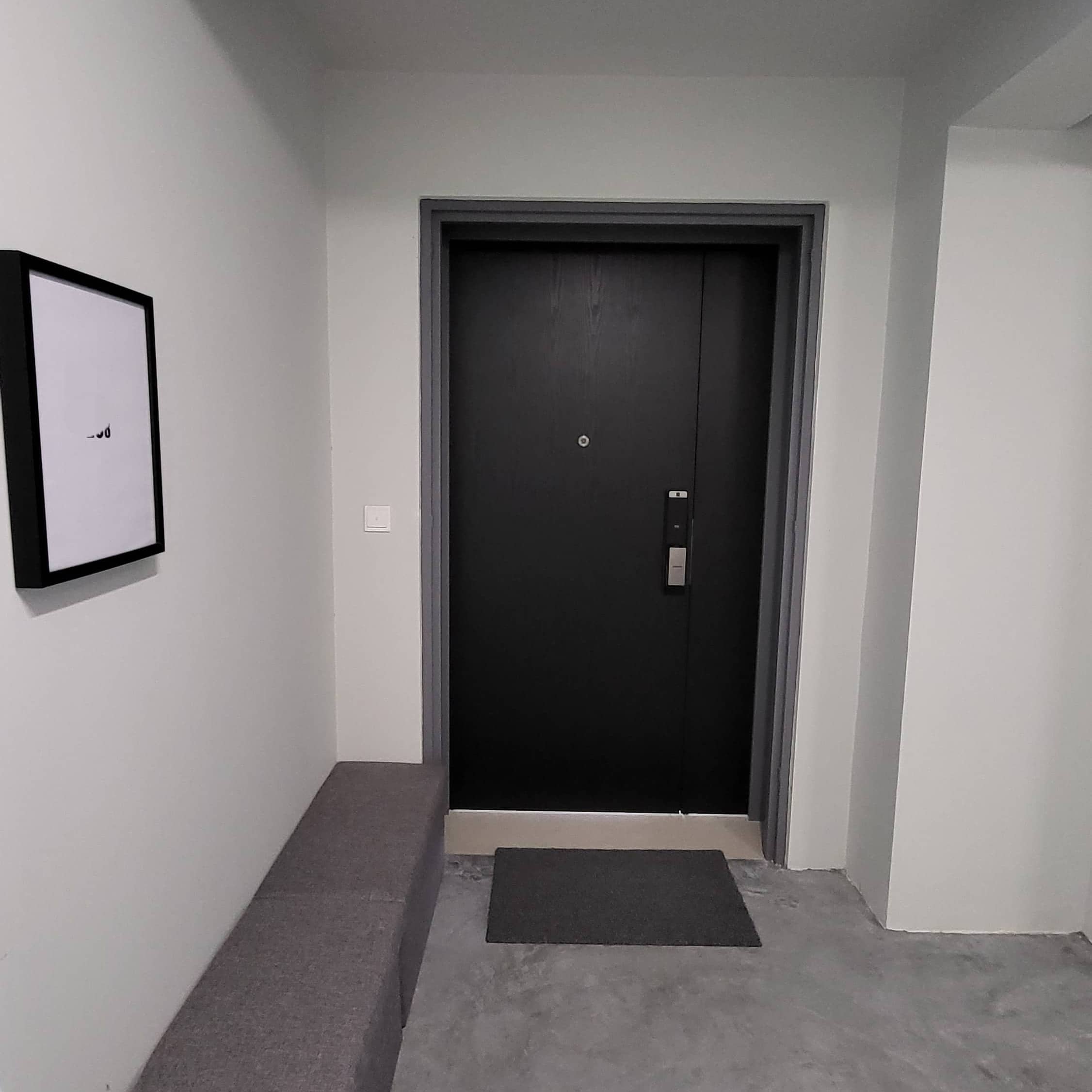
As the unit number was removed along with the gate, he had to find a replacement to avoid confusing delivery personnel and visitors. Inspired by the Beatles’ White album, he eventually replaced it with a picture frame with the unit number printed in bold right in the middle.
Reasonably-priced foldable benches were added because he prefers to put on his shoes while seated, and they also make a great spot to place his groceries while he opens the door to his home.
“As it was expensive to replace a fire rated door, I had it wrapped in black vinyl to hide the awful standard issued dual toned faux wood for the estate,” he added.
Right at the foyer was the mandatory bomb shelter, which now serves as a storeroom and a place for Ethan to keep his shoes.
The vents were inconspicuously painted white to match the wall. However, the placement of the bomb shelter compromised the size of Ethan’s living/dining room, and after much deliberation, he decided that having both in the same area would make the space appear rather cramped.
“From personal experiences, my friends and I usually end up sitting around the dining table or the patio when visiting. What I need is a dining table big enough to accommodate 6 to 8 persons.”
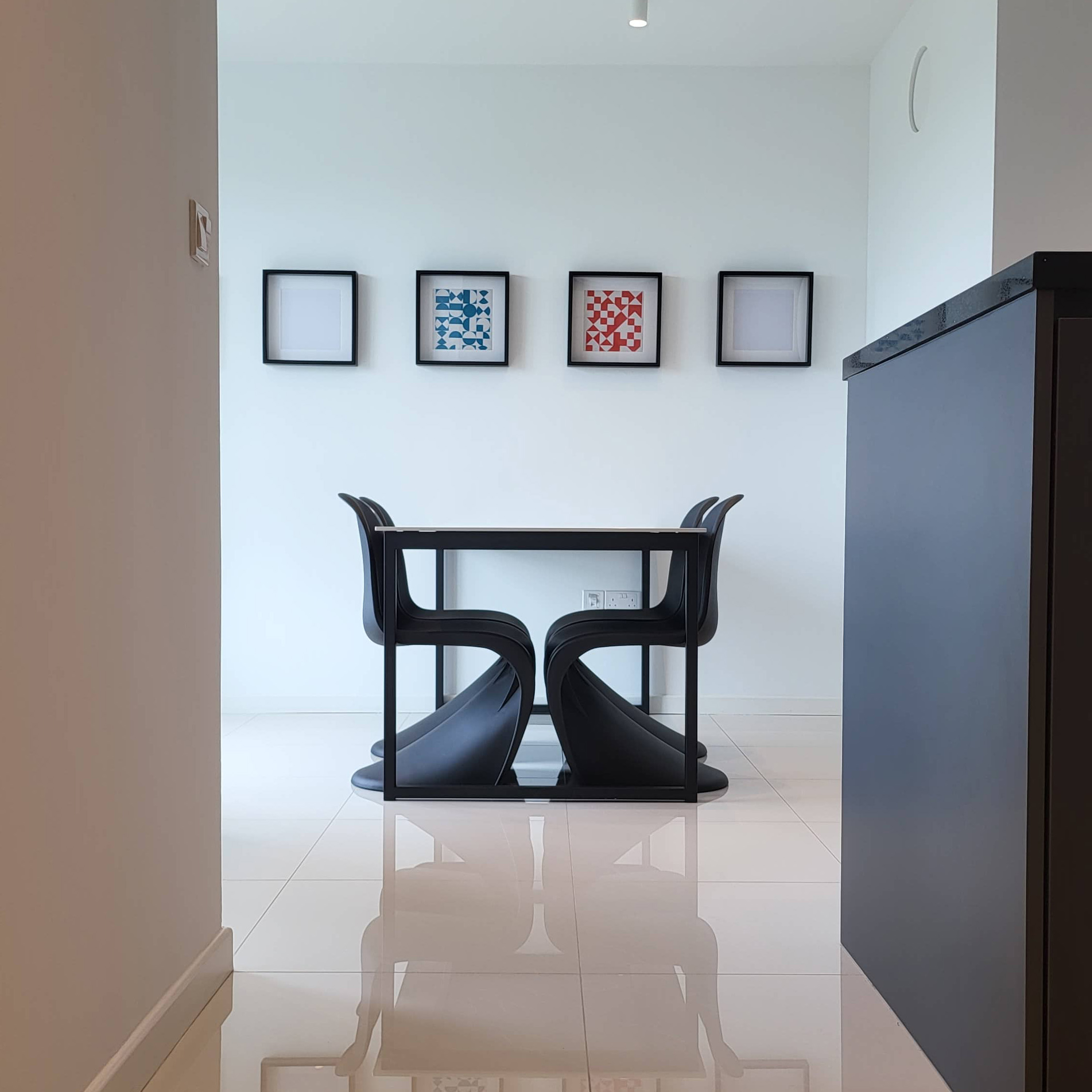
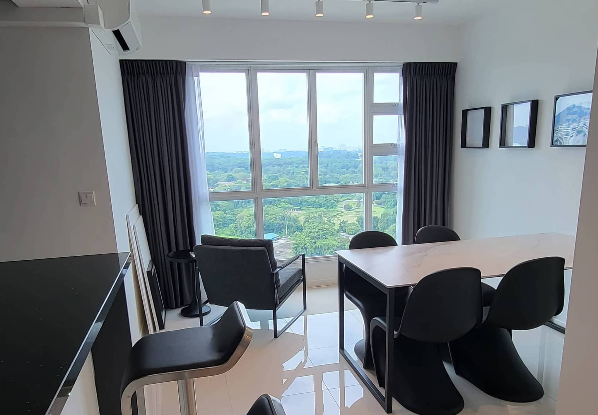
So, he decided to get a dining table that could accommodate 6 to 8 people. He paired it with four Panton chairs tucked neatly on one end to give it an illusion of length, and the remaining spots can be filled with foldable chairs when needed.
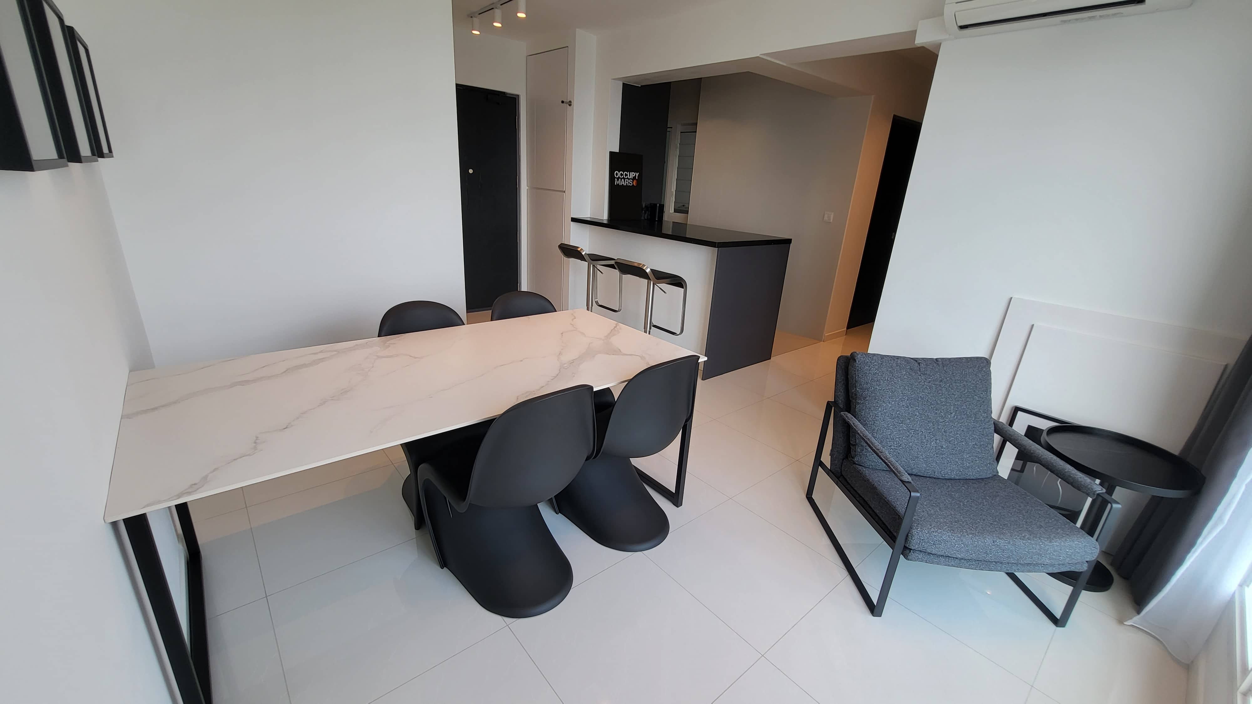
“I made the decision to have white walls and a white table top to highlight the sexy curves of the black Panton chairs.” He placed the dining table in the line of sight of the bedroom walkway for visual appeal when viewed from the other end. This way, he can also enjoy the spectacular view while eating his favourite takeout.
Ethan also added picture frames to the otherwise plain wall and left three deliberately blank, with two Bauhaus Geometry Art in vibrant hues hanging above the dining table to break the monotony of the monochrome setting.
The original timber skirting stood out against the white tiles and walls, and it was the first thing Ethan noticed when he entered his home for the very first time. He painted it white to match the surroundings.
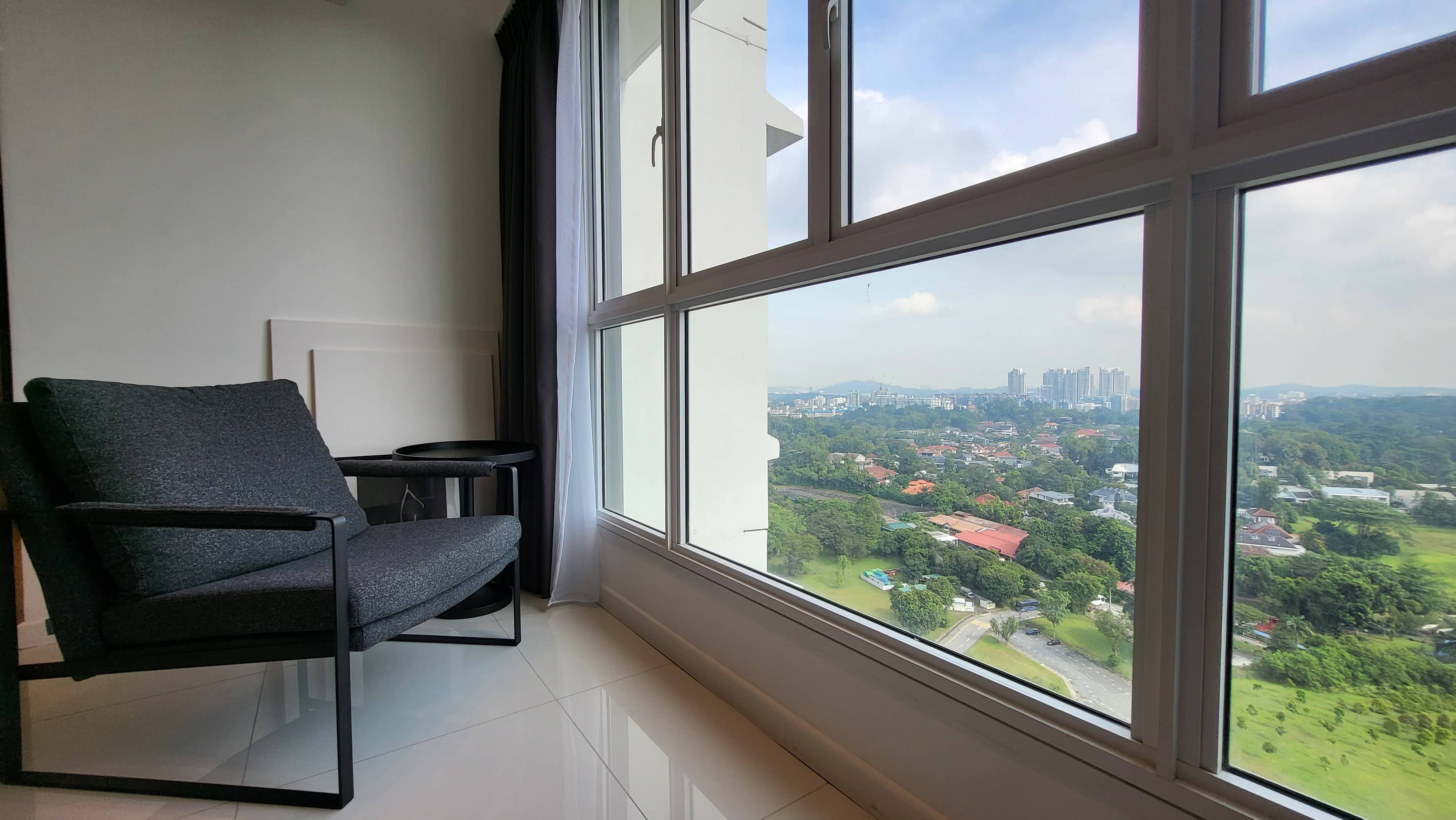
One of the best aspects of the home is that awesome unblocked view, and so Ethan added a grey armchair matched with a black tulip side table to face the wide windows. In this way, he can soak in the breathtaking view while enjoying a refreshing beer on lazy afternoon weekends.
Store Ad In-Content Mobile 60per cent Placement
A peninsular was created with the removal of half a wall near the entrance. His contractor advised him to remove the top half of a wall near the entrance and use the remaining as the base for a peninsular to save on hacking costs.
To avoid cluttering the kitchen with appliances, he built a large cabinet under the peninsular to accommodate a microwave oven and a toaster. He included a pantry to keep all his dry foods and snacks, and he built half shelves in it to prevent out-of-sight forgotten food from being left to rot in the background.
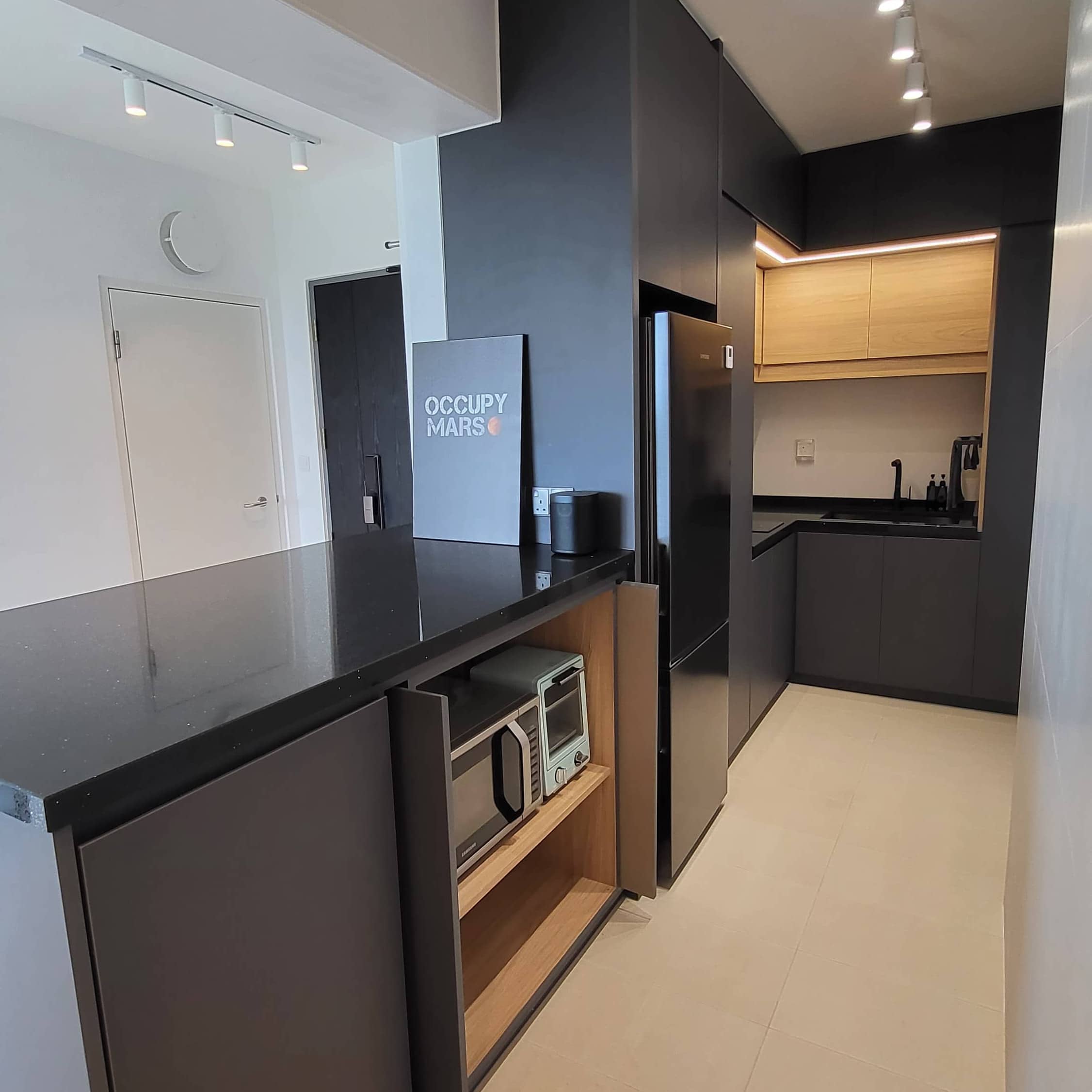
A single glance is enough for him to see what’s available in his pantry. He also put a kettle, coffee maker, and water dispenser in the pantry to further reduce equipment clutter on the countertop.
“A cleaning cabinet was also added in the corner to hide all the unsightly cleaning equipment when they are not needed. Black kitchen fixtures and a black fridge were added to complete the look,” he added.
His pint-sized bedroom is big enough to fit a queen-sized bed, but it’s too small for an extensive wardrobe. It’s not a deal-breaker for Ethan, though. “As I don’t own that many clothes, a two-door wardrobe with four drawers is sufficient for me.”
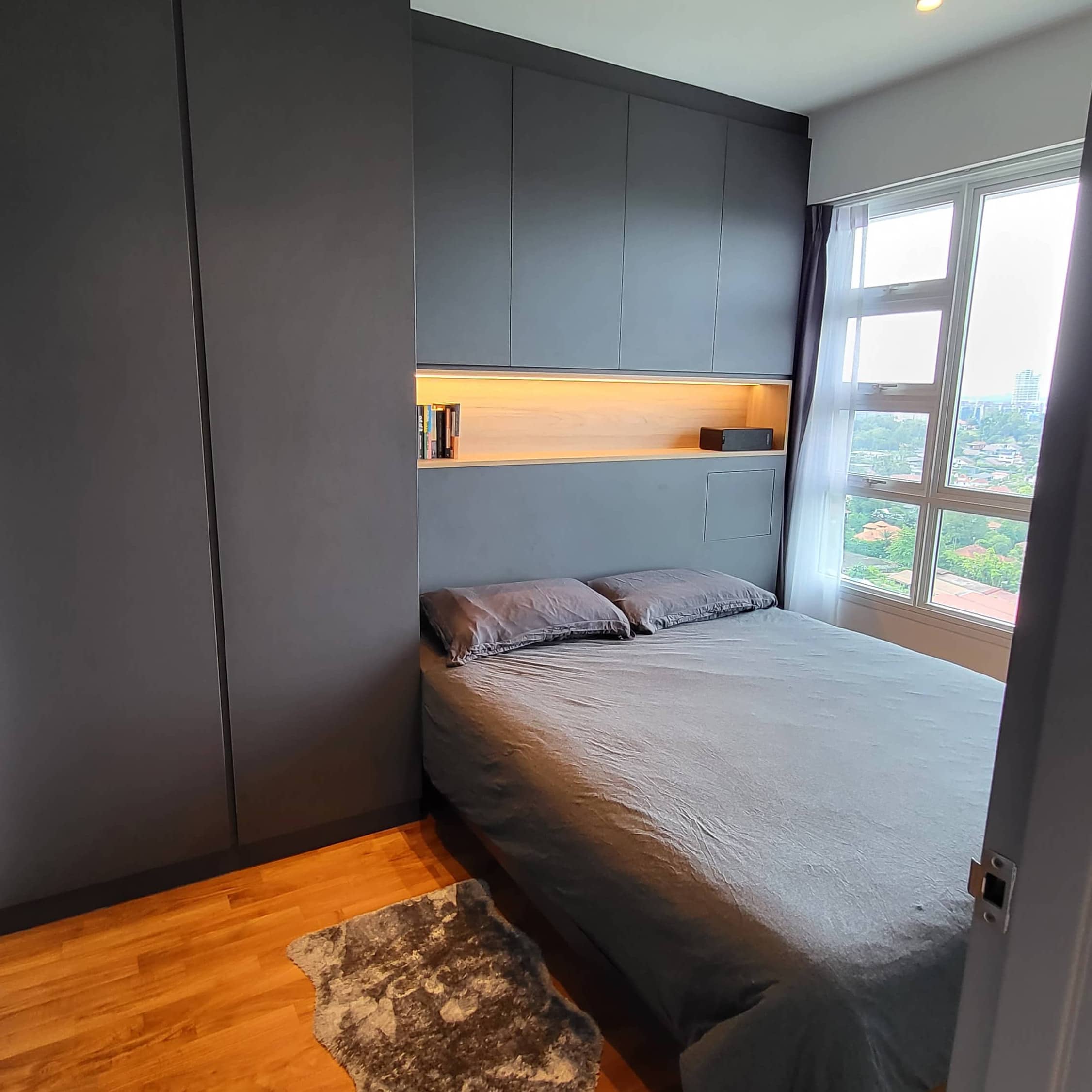
He added additional storage space behind the bed space to store his sheets and serve as a headboard for his bed. The depth of the cabinet was recessed to avoid blocking the windows.
Ethan also created a long niche between the headboard and cabinet and displayed books as decoration to add warmth to the room, although he admits he doesn’t read much. On the other end of it sits a rectangular speaker to break the silence of solo living.
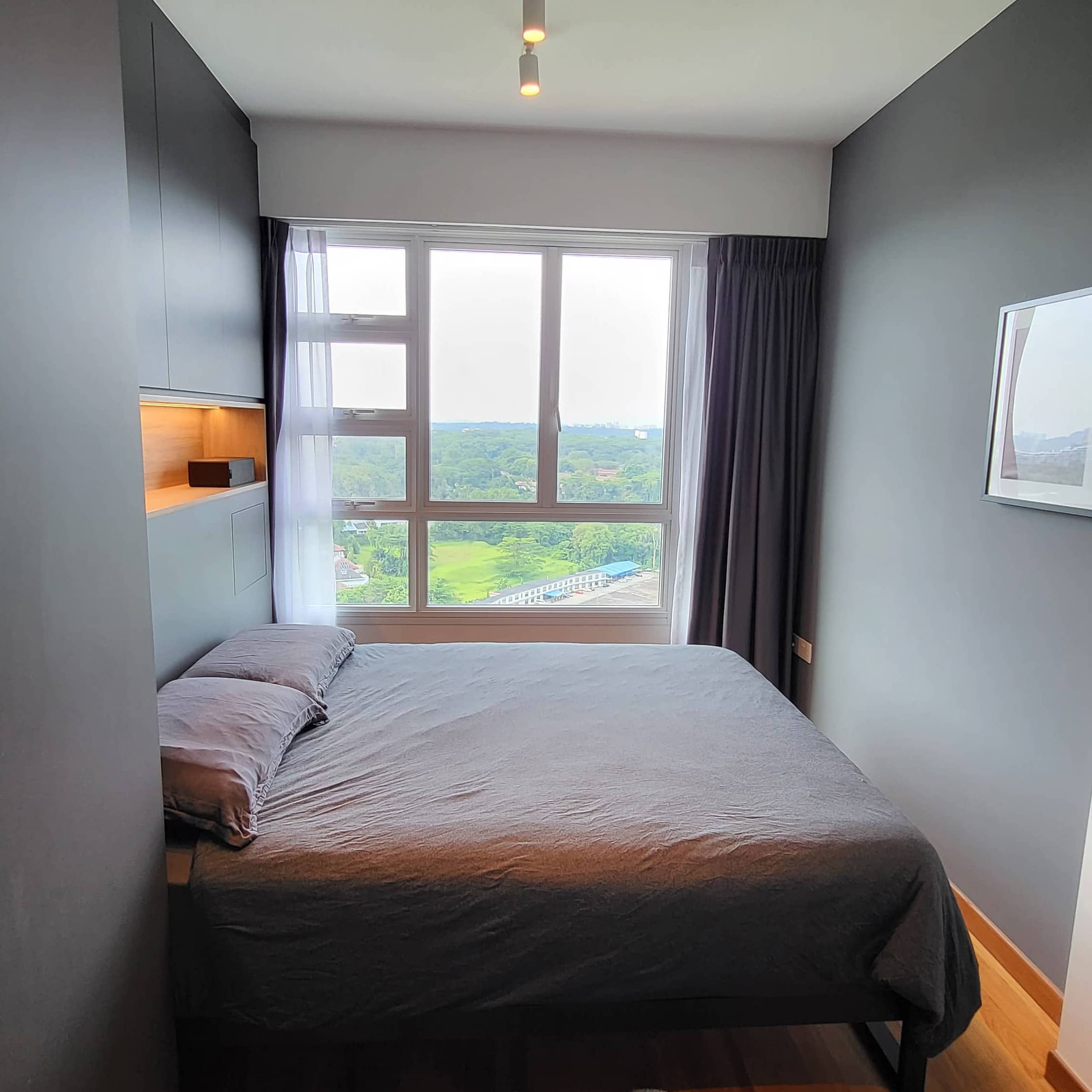
He then built a small hidden nook with a latch door into the headboard on one end to hide the mess of cables and other bedside necessities. The door folds down to serve as a bedside table for his glasses and phone at night. The bed frame was chosen for its simplicity, using dark sheets to match the colour scheme.
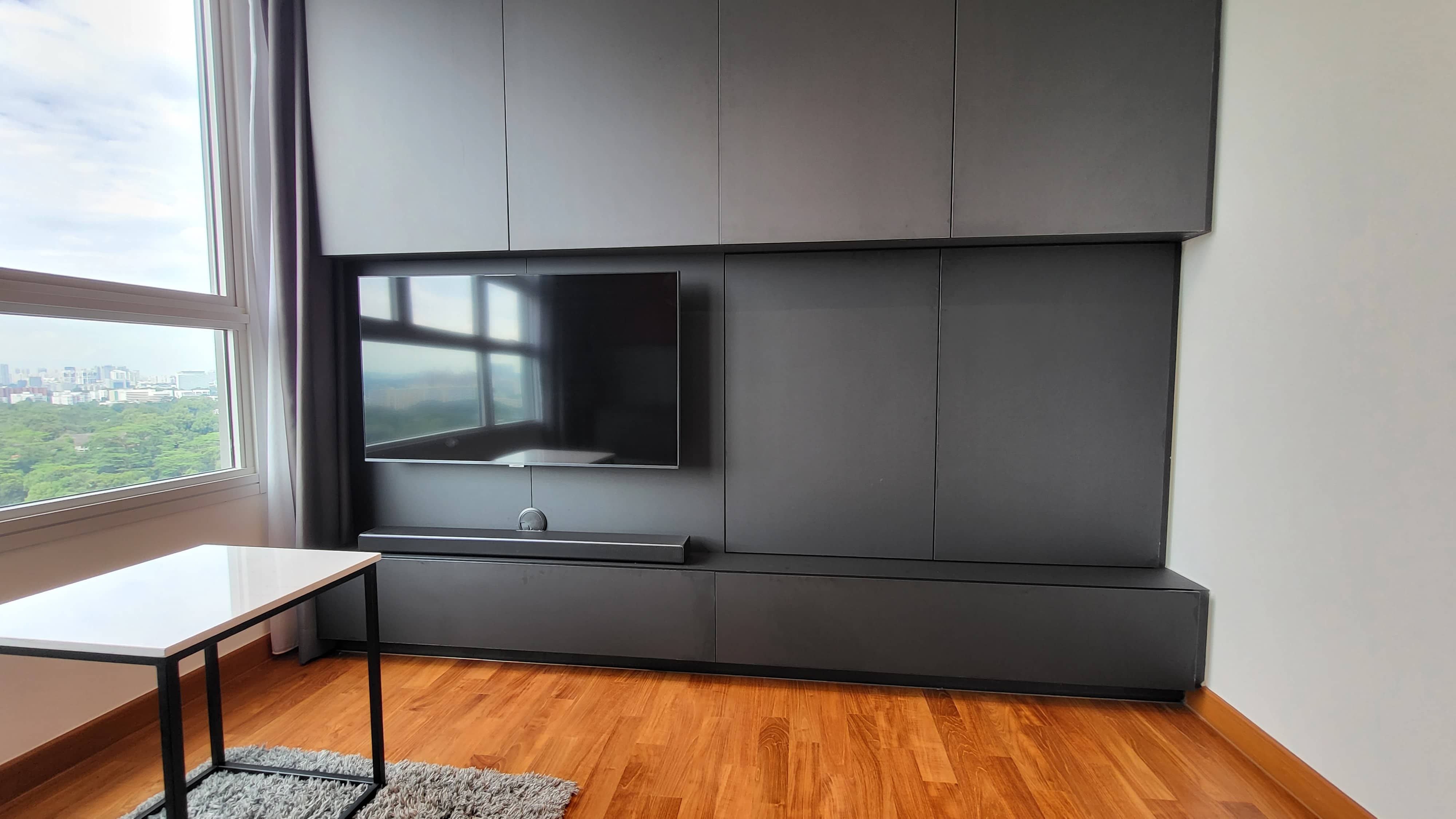
Ethan converted the spare room into his man cave, where he spends most of his waking hours. He built a cabinet that doubled as a TV console on one side of the room and chose black laminates for the lower portion of the cabinet to allow the TV to blend with the background effortlessly.
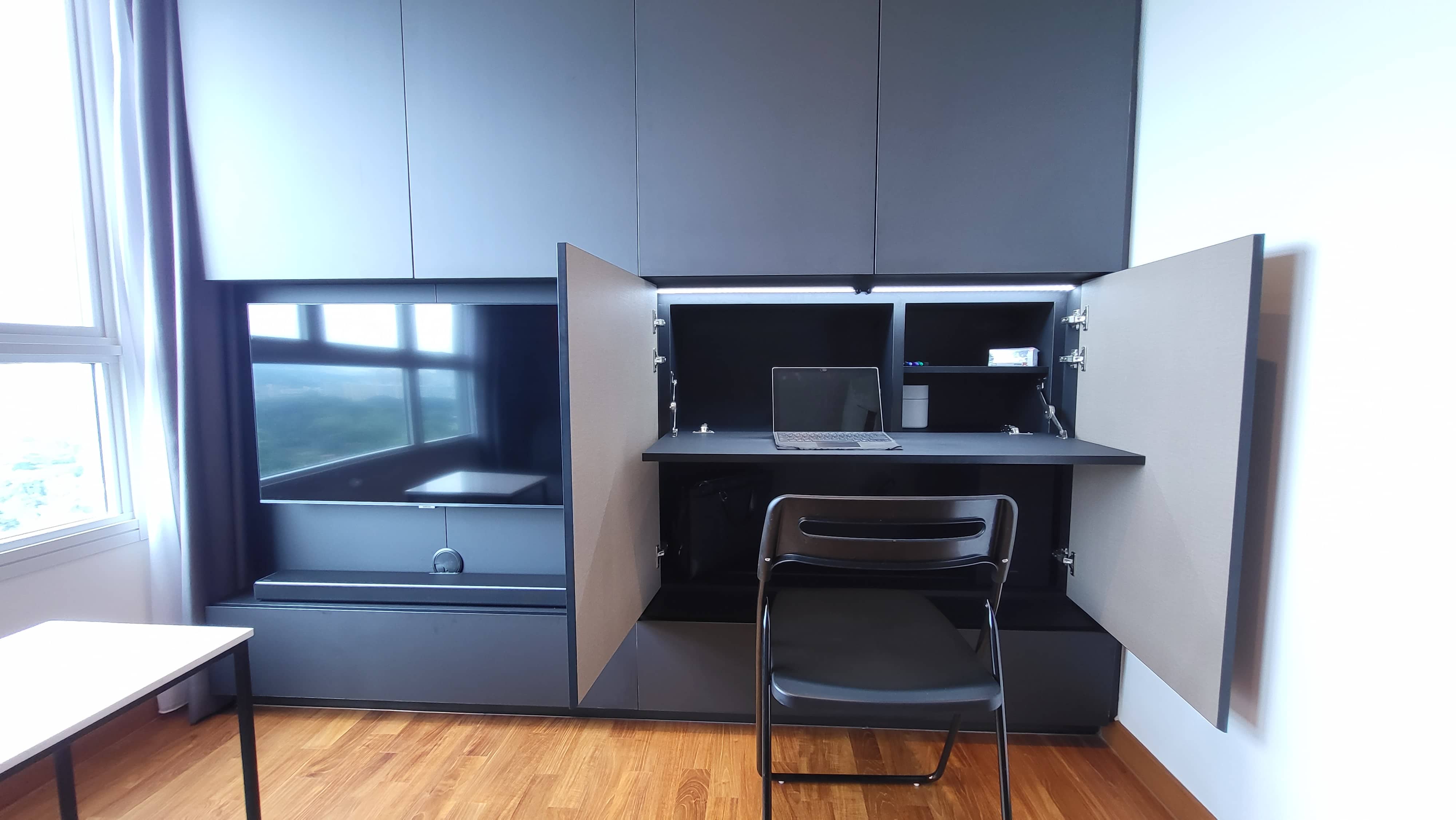
Behind two doors, he concealed a study as a dedicated workspace that stays hidden when not in use. He usually fills workstations with clutter, so having it hidden behind the doors helps take care of that.
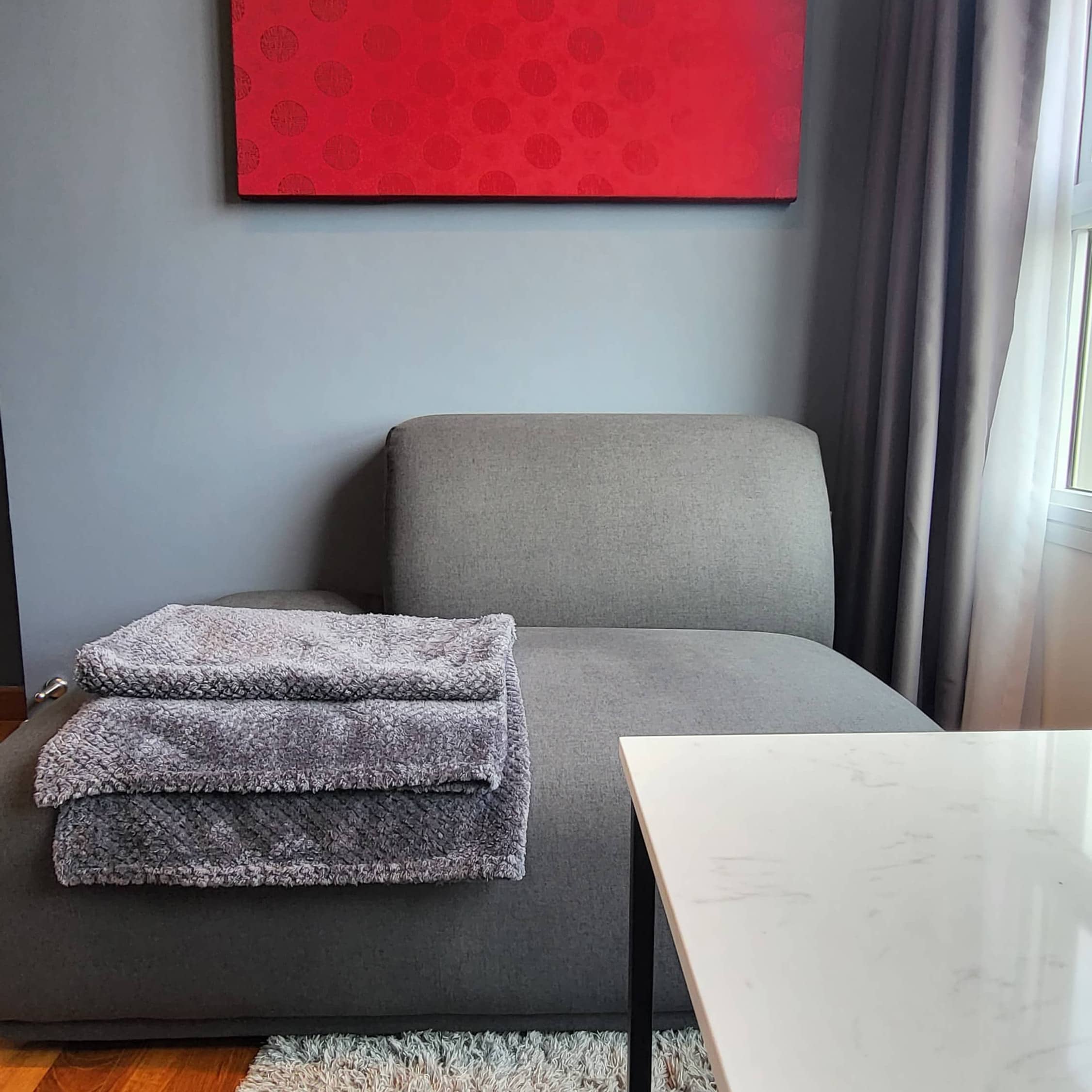
“Choosing a couch was one of the biggest challenges I faced when shopping for furniture. I had to find a sofa small enough to fit the tight space but most small sofas with armrests look proportionately odd,” he said.
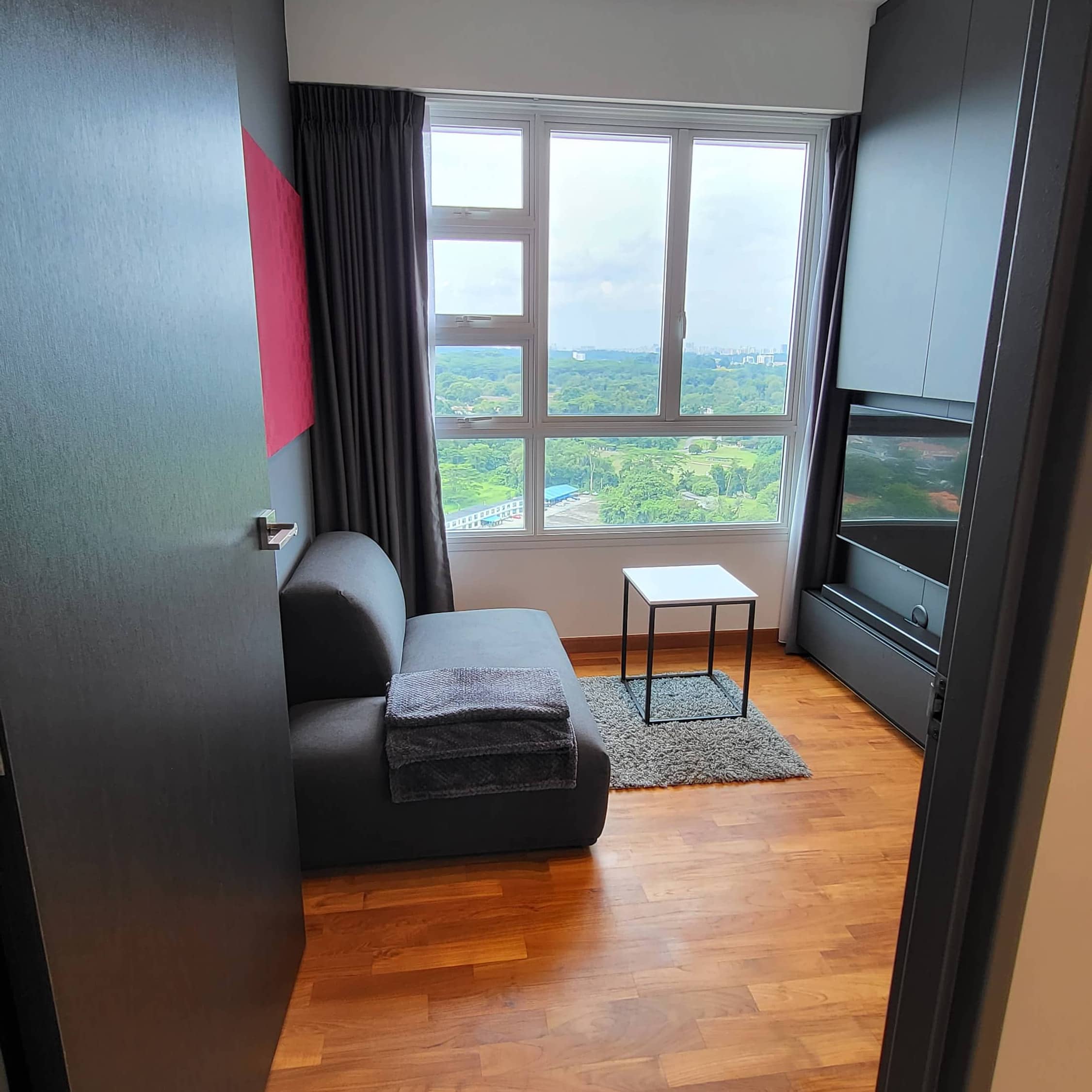
He was about to give up on his search and settle for something he didn’t quite like when he found a modular sofa’s corner piece that fit perfectly. Ethan personally crafted a burgundy chinoiserie silk art and hung it on the grey wall right above the sofa to add a textured colour accent to the room.
The flat has two baths, and since they have a similar layout, he decided to replicate the design. He built storage cabinets in all available spaces to store towels, toiletries, toilet rolls, and cleaning agents.
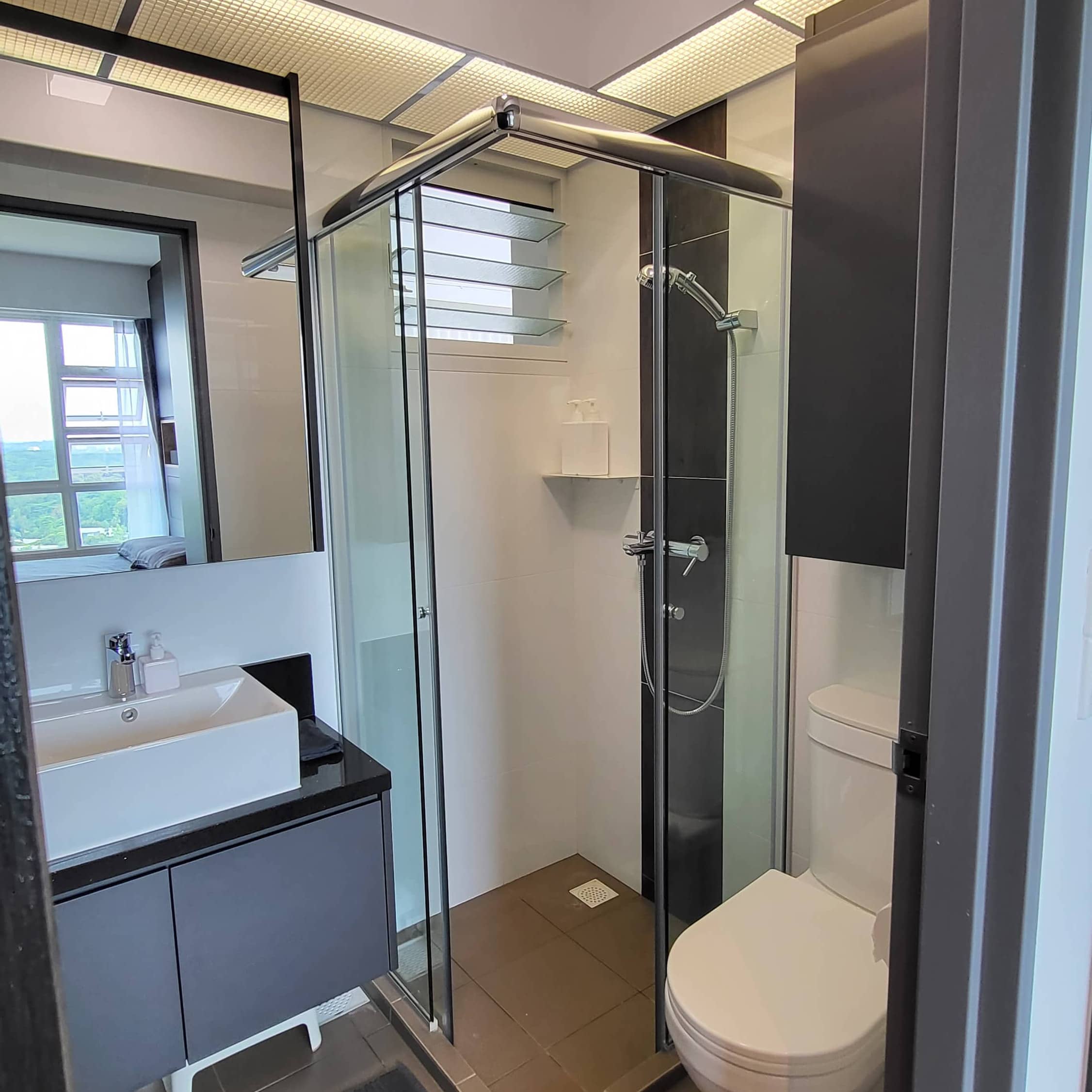
Then, he colour-matched the towels and floor mats with the interior and mounted white soap pumps and trays on white tiles so they were almost invisible to the eye. He said that the adjustable shower rail was an eyesore, so he removed it to reduce vision clutter and replaced it with a fixed holder.
Designing a home yourself can be a fun experience, giving you more control over the whole project. Ethan recommends deciding on the design scheme right at the beginning and trying not to deviate too much from it, especially when it comes to choosing furniture and appliances unless you’re planning for an eclectic theme.
He emphasised his point further by citing an example from his own experience.
“Being financially poor with very limited resources, I had a list of optional items that I could live without to keep my budget in check. When it is a necessity but is beyond my budget, I knew which areas to focus on to find alternatives to things I couldn’t quite afford while keeping the form consistent.”
During the renovation, he made many trips to the carpentry factory in Mandai for discussions whenever the supervisor had issues with his designs. The in-depth discussions helped solve some of his design flaws and allowed them to find alternatives that wouldn’t compromise on both form and function.
And here’s a specific tip if you’re going to buy air conditioning.
Ethan recommends that if you’re planning to buy a System 3 AC unit, you should opt for a System 2 and a System 1 to maximise the number of compressors allowed with a flat.
In the event that one of them breaks down, you’ll still have a spare and not have to suffer the wrath of the punishing Singapore heat. Moreover, you’ll only have to replace a smaller unit when you need a replacement.
“Surprisingly, when shopping for such a combination, I discovered that, all things equal, it costs marginally less to buy two smaller units than a single large unit,” he disclosed.
ALSO READ: Couple spends $38,000 to turn 4-room resale flat into cosy British-inspired home
This article was first published in Stackedhomes.