This pink Punggol home takes design cues from postmodernism

Postmodernist elements (and pastel pink!) inspired the look of this one-of-a-kind HDB home at Punggol.
"Unconventional, fun and vibrant," answers interior designer Joanna Chia when asked to describe the look of this charming HDB apartment, which was created together with her fellow creative at Mr Shopper Studio, Rachael See.
To achieve the unique look of this 112 square meter abode, which a young family of four calls home, designers Joanna and Rachael utilised "curve, line and shade" - the very same elements that famous 20th-century postmodern designers worked with.
"Our main inspiration (for this home) came from Ricardo Bofill. He is a Spanish architect who is unafraid of mixing colour with structure," shares Rachael. "We also found ideas from the minimalist works of John Pawson as well as those of Luis Barragán, who makes really interesting use of colour and texture."
ABOUT THE DESIGN BRIEF
Joanna (J): For the owners, the most important thing was to have a functional home that is also bright and airy. Even though they didn't specify a preferred look, both of them agreed that they wanted something unconventional - which is why Rachael and I thought it would be a great opportunity to introduce postmodern elements.
ON THE OVERALL AESTHETIC
Rachael (R): When we created the look for the house, Joanna and I found inspiration from the works of various postmodern designers, so you could say the final aesthetic is a mix of their philosophies. If I had to describe everything simply, it's all about having the right colours, curves and accents throughout a home.
ON CHANGES MADE TO THE HOME
J: Aside from the signature pink hues, you'll also notice the open-concept layout from the moment you step into the house. We intentionally linked the living room, dining area and the kitchen so that it feels like a single, spacious area, just like what the owners wanted.

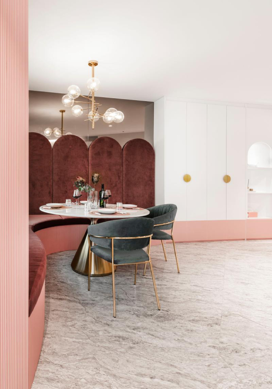
R: What will probably catch your eye as well is the dining area. The house had an odd layout and we filled in one of the corners in the space with the current dining area. We dressed up the settee with plush velvet cushions and put in storage below the seats for added functionality.

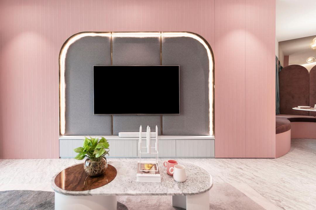
J: For the feature wall, we used wood panels because of their natural texture that makes the entire structure appear less flat. We made sure that the openings and seam lines of the storage compartments weren't too obvious by painting them entirely in pink.
R: Also, the feature wall's cut-out pays homage to the archways in Ricardo Bofill's works. We created it by electroplating a steel frame before installing it together with grey cushion backing made from easy-to-maintain Aquaclean fabric.

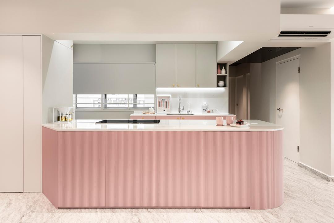
J: The homeowners enjoy entertaining and we thought about giving them a bigger cooking/gathering space by knocking down the walls around the kitchen. This also helped to make way for a large island; it has storage on both sides as well as enough room for an inconspicuous downdraft hood to be installed.

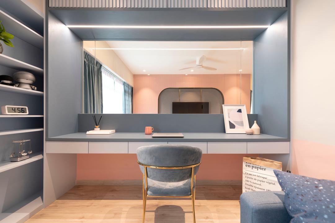
For the study, we knocked down half of the front wall to make way for a window that looks into the living area. Because of the visual link, we were careful about the colour treatment of the study. For example, we used a light blue for the window's frame so that it wouldn't look out of place with the view outside.
R: Because it's a space for rest, the master bedroom's colour palette is slightly darker with more blues as it helps create a more relaxed atmosphere. For the same reason, we incorporated cove lights to give the bedroom a cosier vibe.

On the aesthetic side, we made sure to include plenty of curves to keep the bedroom's look consistent with the overall design language. You can see this from the bed's headboard cushions, the round light box as well as the accessories that were chosen, such as the pendant lamps and the various mirrors in the space.
ABOUT DESIGN CHALLENGES
R: Figuring out how to make the apartment's layout work was definitely one of the biggest challenges of this project, we had to think carefully about what would go where so that the entire space would be maximised.
The same goes for figuring out the renovation timeline. Even though it only took about eight to ten weeks to complete this project, it was a challenge to ensure everything came in at the right time, especially the customised fixtures and accessories.
TO SUM UP
S: This was a fun project to work on! We had plenty of freedom coming up with the look for the house. Most owners prefer safe neutrals and clean lines, so we are really glad to have this opportunity to create an eye-catching home that's different from the norm.
This article was first published in Qanvast.