Swedish study finds in-car physical buttons more intuitive and safer than touchscreen controls


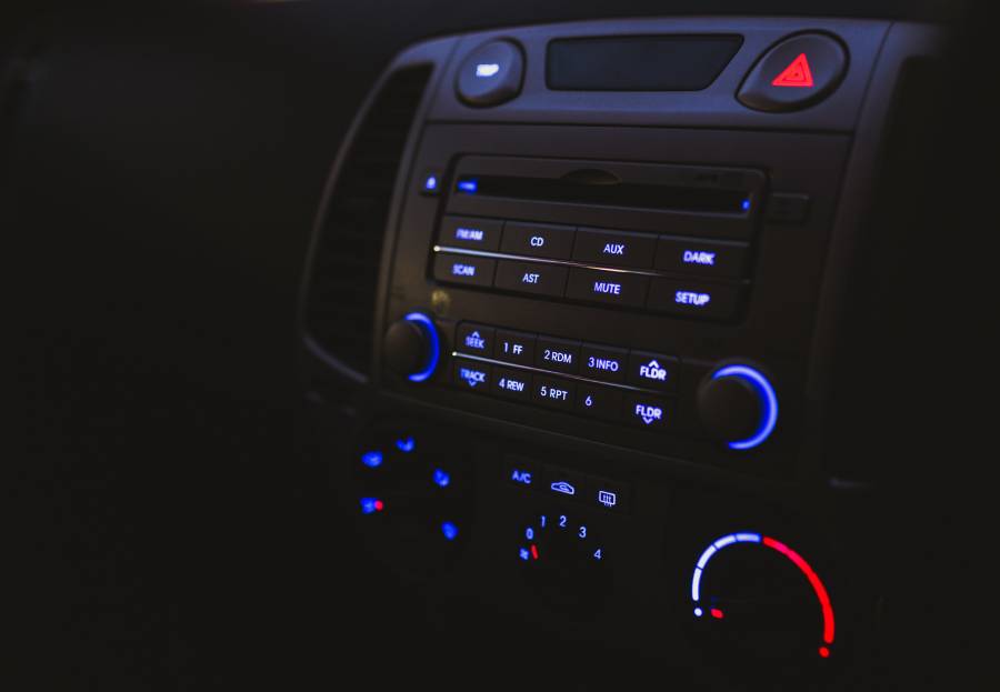
For well over a decade now, many motoring journalists and critic have lamented the slow demise of in-car physical buttons and switches.
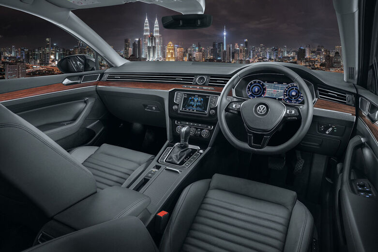
In the pursuit of lowering overall cost and tidying up cabin space, these controls have all been switched (no pun intended) with digital equivalents, through expansive touchscreens across the dashboard.
With the loss of physical switchgear, many have felt that toggling through menus and pages on a digital screen would not only a lot more time-wasting, but also more dangerous.
Swedish car magazine Vi Bilägare went on to prove exactly that through a human-machine interface test conducted across 12 cars.
11 of them were brand-new, including the BMW iX, Nissan Qashqai, and Tesla Model 3. The final car used was a 2005 Volvo V70 station wagon (equipped with physical buttons), as a comparison.

The timed test comprised of four tasks: activating the heated seat, increasing the cabin temperature by two degrees and then starting the defroster, powering on the radio and tuning in to a specific channel (Sweden's Program 1), resetting the trip computer, and finally lowering the instrument lighting to the lowest level before turning off the centre display.
Another constant of the test was that each vehicle would be travelling at 110 km/h.
To ensure that the test was fair to all parties involved, the drivers were given time to get to know the cars and how to operate the respective infotainment systems before the test commenced.
The test results spoke volumes. Out of the 12 cars, it was the Volvo V70 that was the easiest to understand and operate with its physical switchgear.

It took only 10 seconds for the driver to accomplish all four tasks, covering just 306 metres at 110 km/h.
The Dacia Sandero and Volvo C40 took slightly more time, at 13.5 seconds and 13.7 seconds respectively over 414 to 417 metres.
In contrast, the MG Marvel R rated the worst, taking a leisurely 44.6 seconds to complete the given tasks.
Consequently, it covered 1,372 metres, more than four times it took the V70.
According to Vi Bilägare, the issue was not just about the lack of buttons, but how a user interface is designed.
They noted that despite the BMW iX and SEAT Leon both performing better than the MG, they still required almost 1,000 metres to complete the tasks due to their complex and complicated UI systems.
The publication also took issue with cost-cutting measures undertaken by some automakers. Touch-sensitive climate controls below the screen for the Volkswagen ID.3, for example, did not feature any backlighting, and were therefore invisible at night.

All of these findings point at increased distraction on the roads, with the drivers spending far more time fiddling through menus on the screen than focusing on the road ahead.
With almost every other manufacturer adopting touchscreen controls for just about every aspect of the car, perhaps it is time to seriously reconsider this lazy shortcut and re-introduce some buttons for easier navigation.
Or at the very least, design a far less complex UI like on the Polestar 2 so that distraction is minimised while still retaining a minimalist-looking cabin.