These are the trending colours to use in your home in 2020

Every year, colour and paint experts announce their Colour of the Year. Whether it's a bid to sell their less popular paints or real research into consumer sentiments, everyone gets really excited by them.
At Renonation, we too are suckers for trends.
So we've decided to put together some of 2020's coolest colours, according to the experts, and show how you can introduce them into your own space with real-life examples from Singapore's homes.
Grab your swatches and let's get started.
PANTONE'S CLASSIC BLUE
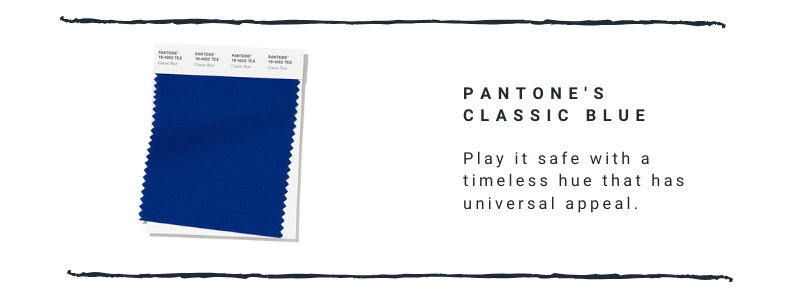
No one knows colours better than Pantone, and this year, the colour specialists have announced the very timeless Classic Blue as its Colour of the Year, a hue which, according to Pantone, is meant to instil "calm, confidence and connection" as we head into an unstable era.
It's somewhat of an overstatement, but we do agree with how safe and enduring Classic Blue can be.
You can't get a trending colour that is more un-trending than that. When used in the home, it can't go wrong. It's neither feminine nor masculine and it functions almost like a neutral, except when paired with other neutrals-that's when it really gets to shine.
The classic blue hue is often found in coastal/nautical themed homes, conjuring images of the ocean and skies.
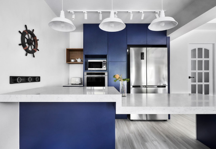
This long-lasting hue works perfectly with brassy touches for a more luxurious appeal.
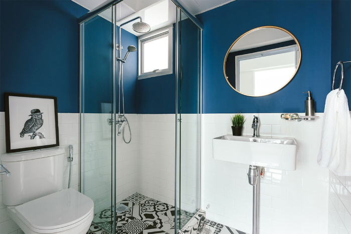
Make things visually interesting by playing with different shades of blue.

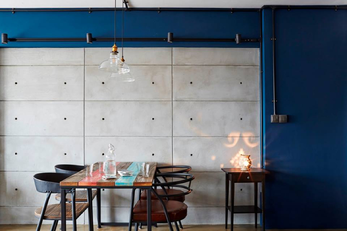
Pairing classic blue with a neutral-toned wall like this cement screed surface allows it to stand out as a focal point.
DULUX'S TRANQUIL DAWN
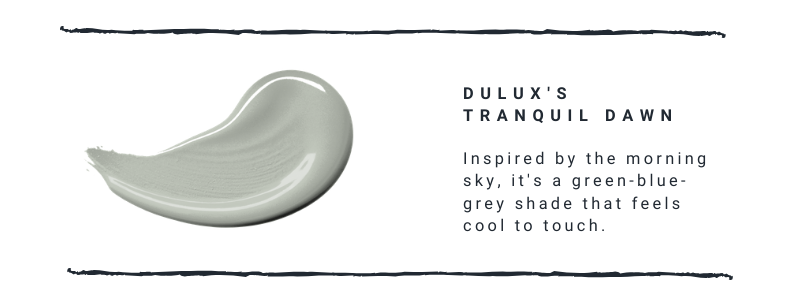
Like Pantone's Classic Blue, Dulux's Colour of the Year, Tranquil Dawn, is also a bid to inject a sense of calm amidst the hustle and bustle of life.
Inspired by the hues you find in the sky in the morning-green, blue and grey-it represents a "fresh start" and a "new dawn" so to speak.
Green has been popular paint colour for a couple of years now, although this very pale shade is one we haven't seen very much of.
It's a great choice if you are looking to create a moody, Scandi vibe since it features more of a cool tone.
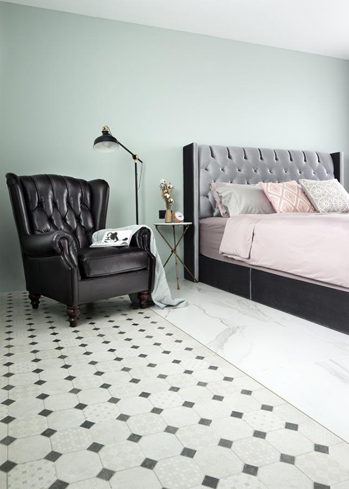
Tranquil Dawn is neutral enough to work as the main colour in a space. It contrasts nicely with black, which serves as the accents in this bedroom.
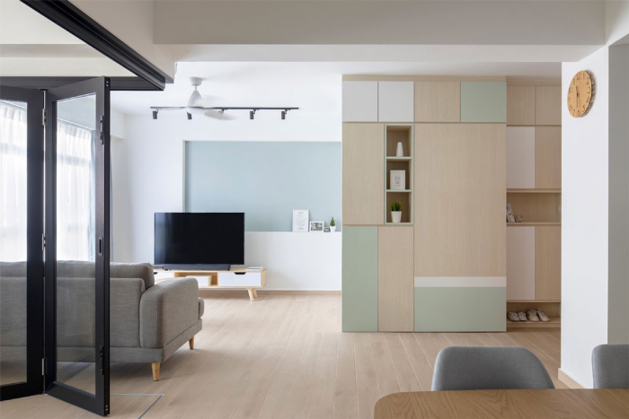
This muted green can work as a subdued accent colour too, creating a sense of calm and serenity in this HDB flat.
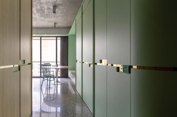
The shade of green used in this entryway storage is a bit more minty than Tranquil Dawn, but we can definitely see the pale hue working perfectly here. Complementing this hue with gilded accents elevates this space immediately.
BENJAMIN MOORE'S FIRST LIGHT
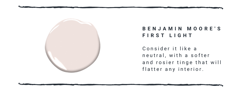
More fun than beige or white is Benjamin Moore's First Light. It's a tribute to the interior design world's obsession with pink. Except, it's just a bit subtler, softer and less saccharine-it's like millennial pink all grown up.
It's decidedly more feminine than Tranquil Dawn or Classic Blue, but it's definitely a versatile colour that works with most hues.
Like Tranquil Dawn, First Light can work really well as a neutral, but it also has the ability to hold its own thanks to its rosy shades. Pink is also very chic at the moment, so you will definitely be on-trend if you use it in your home.
We don't think of this pale shade as a particularly opulent one. But pair it with jewel tones and voila! Instant sophistication.

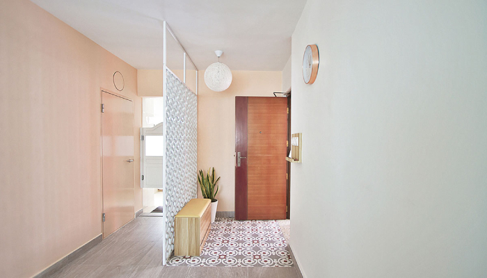
First impressions are the most important, so why not use the pink colour at your entrance? The shade used in this foyer leans towards peachy, but a First Light shade will steal just as much attention when used here.
Bathrooms don't have to be functional and boring spaces. Pale pink tiles were paired with interesting textures and patterns so that this space feels chic and modern rather than retro.

This article was first published in Renonation.