The evolution of HDB floor plans over the years - are they for better or worse?


From the days of HDB terrace houses to today’s tiny flats, the concept of an HDB property has changed over the years.
We see it quite often on the faces of older Singaporeans: Whenever someone is buying their second flat after many decades, they say things like “Wow, is this a condo or an HDB flat?”, or “Huh? This is a four-room flat? So small?” Here’s a look at how things have transformed:
Before HDB, there was SIT. It was set up by the then British colonial government, to build affordable housing in Singapore.
We can’t even show you many HDB floor plans, because many have been lost to time. But if you want to see the inside of an SIT flat, your best bet is to try and get inside a flat in the Tiong Bahru conserved blocks. To our knowledge, these are the best preserved and least modified (even indoors) SIT-era flats.
That aside, here are some HDB floor plans from the days of SIT:

This is a three-room flat from Redhill Close. Notice that there’s actual yard space, which you’d never find in HDB flats today. Also interesting is the heavily enclosed kitchen – quite different from the open kitchen concepts in today’s BTO flats. This flat is about 678 sq ft.

We don’t know how big this two-room flat is, but the concept of a two-room unit with a verandah would raise some eyebrows today. But a lot of home buyers today would frown on what seems to be the public stairwell adjacent to their living room wall; that could be pretty noisy in today’s denser flats.
This unit is somewhere in Tiong Bahru, and may even still be there today.

This is a three-room flat at Tiong Bahru, but at 947 sq ft, it’s almost a four-room by today’s standards. One common tendency is that SIT floorplans are quite generous, with regard to bedrooms.
Notice that in all three HDB floor plans here, the bedrooms are almost as large – if not even larger – than the living room. In newer flats, it’s common for the living room to be much bigger than most bedrooms (except maybe the main bedroom).
Also, a common feature at the time was to separate the toilet and bathroom with a partition; something that we seldom do in newer layouts (HDB or private).
SIT also built some terrace houses, for which we only have one floor plan:

We don’t know the size or where this is. When we showed it to an Interior Designer though, she laughed because it’s a landed property with only one toilet. Granted, it’s probably annoying that you have to walk all the way downstairs and past the living room, to use the toilet.
(Especially at night when you’re getting out of bed to do it – both bedrooms are upstairs).
Nonetheless, we’re sure many home buyers today are envious of the space it provides – and the prospect of having a backyard big enough for serious gardening.
When HDB took over in the 1960s, it was a period of urgency. The newly independent (from the British) government was still finding its feet, and a major fire at Bukit Ho Swee had left around 16,000 Singaporeans homeless.
The flats of this era, while larger than flats today, are in some ways more austere. They were built with just functionality in mind. Also, there was no such thing as a five-room flat, in this era. The biggest units were four-room flats.

This was a typical 646 sq ft, three-room flat at the time. You can see the usual signs of an older layout: an enclosed kitchen, and separation between the bathroom and toilet.
There was also the love-it-or-hate-it garbage chute in the kitchen, unlike newer flats today where trash is taken to a common dumping area.
This was a feature that would remain for many decades, and often sparks debate (some homeowners like the convenience, others say it breeds vermin near the kitchen).

There was also a three-room flat, which was slightly larger at 743 sq ft. As you can see though, there wasn’t much difference in layout – it’s practically the same thing, with some added square feet.

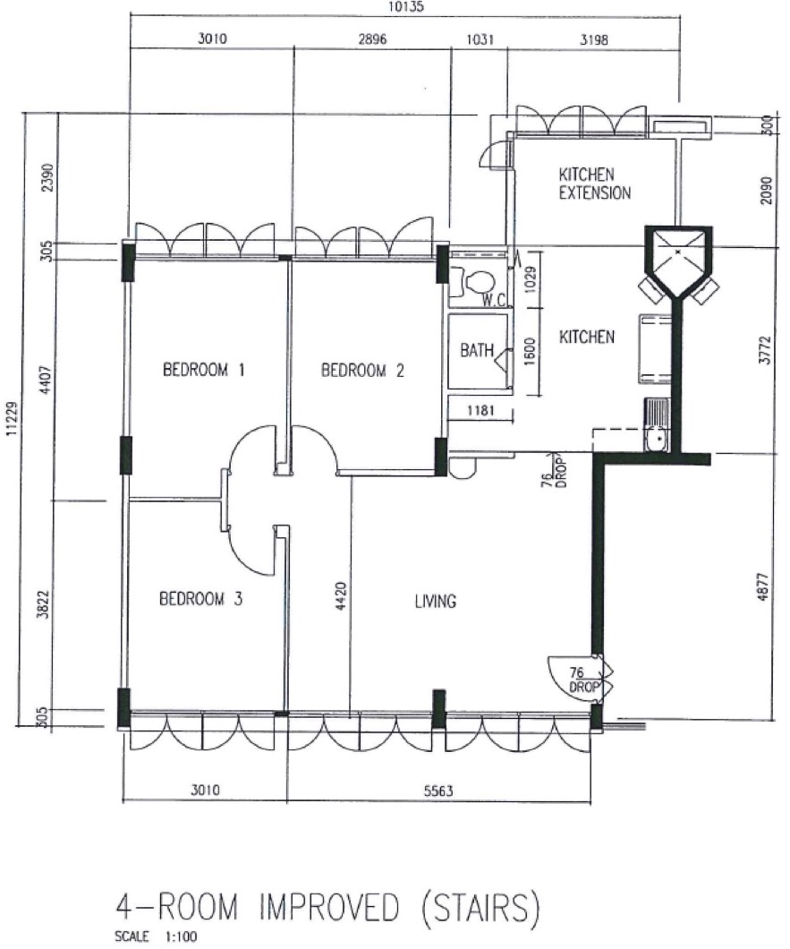
This four-room flat, at 936 sq ft, tucks all the bedrooms to one side of the unit, and the kitchen on the other. There is a bit of wasted space and a “dark spot” though, where the doors of the three bedrooms meet.
What’s interesting here too is that these four-room flats at that time only came with a common bath and toilet. Which is a downside for big families.
At this point, note that individual bedrooms tend to be smaller than the last decade; more space is given to the living room.
For starters, four-room flats came into being and quickly became a big hit. We also saw the emergence of the first truly “hot” HDB estate, which showed how much flat values could rise – this would be Marine Parade, where until today, not a single block has been demolished.

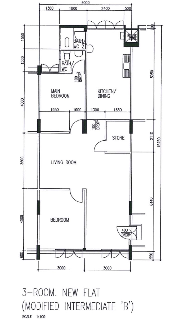
This 882 sq ft three-room flat has the now-familiar features of a storage or utility room, and a designated main or master bedroom.
The toilet and bath have been combined into a single room, and there are now two bathrooms in the same unit – one of them is an en-suite bathroom for the main bedroom.
The living room is a bit of an odd shape, but it makes sense when you realise the area near the kitchen can act as a separate dining space.

This 990 sq ft four-room flat shows the same new (for the time) trend – it also has a designated main bedroom with an en-suite bathroom.

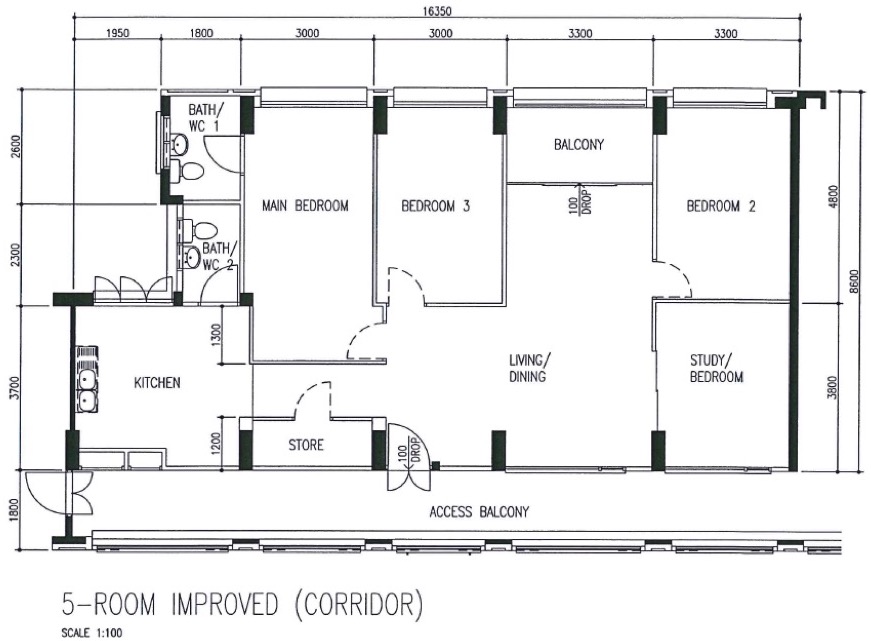
The five-room flats from the ‘70s and ‘80s are quite desirable for their spaciousness. The first five-room flats could reach up to 1,302 sq ft, like the one above. Notice the unusual balcony between the main bedroom and the other two bedrooms – this allows ventilation and light into the dining area.
Also, at that point in time, these five-room flats would mostly come in point blocks. It is common that the whole block only sees the same unit type as well.

The maisonette was a two-storey HDB unit, and versions like the above could reach over 1,571 sq ft. Notice that the layout includes three bathrooms: one for the ground floor, top floor, and an en-suite bathroom for the main bedroom.
We’re not sure how people today would feel about the main door opening into the dining room before the living room though; most people would probably reverse it, using the area near the balcony as the dining room.
The top floor layout has a lot of dark corners outside of the bedrooms, and it’s especially dark if all the bedroom doors are closed. Nonetheless, this was an interesting new direction, at higher-end public housing.

In the five-room flat above – which is at the end of the corridor – the main door appears to open up into the balcony; something we rarely see in HDB units today.
The storage room – which in the 1970s had almost always been near the kitchen – is starting to drift around the unit as well. Here it’s between bedrooms, while in the maisonette above, it’s next to the main entrance.

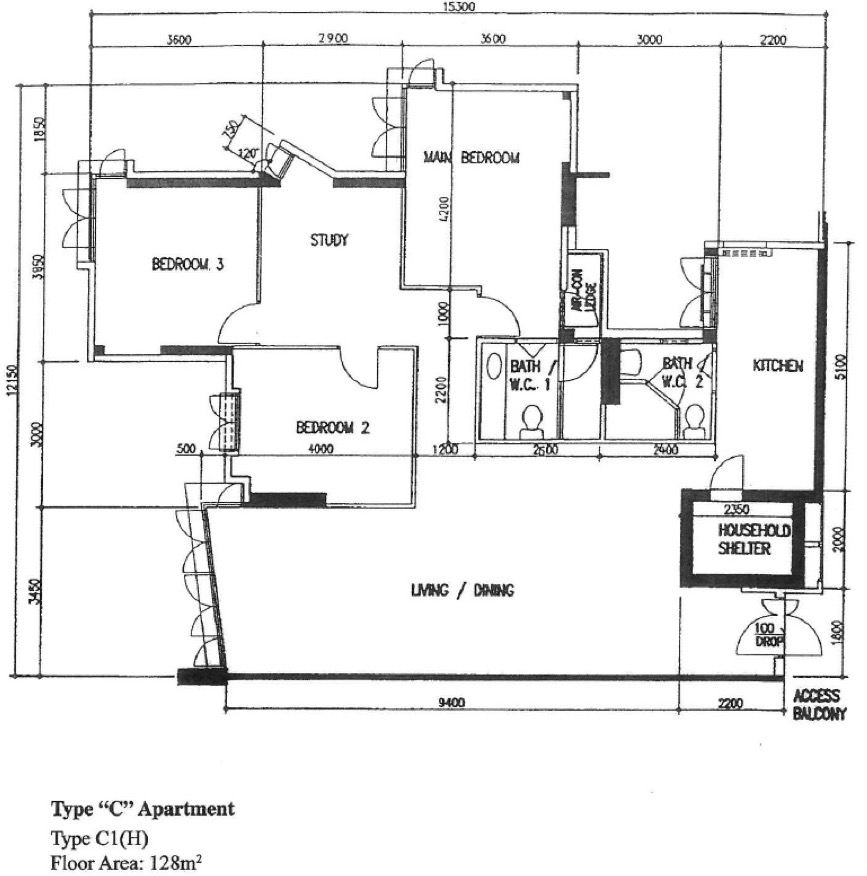
The 1980s also saw the emergence of the Executive Apartment, which could also reach over 1,530 sq ft. The layout above is unusual, in that it has clearly separated the living room and dining area – it’s not just one common space. There’s an actual study/bedroom between the two. This isn’t actually very efficient though, as it creates wasted corridor space linking the two.
The ’80s seemed like a very experimental phase for HDB, in terms of both new unit types and possible layouts.
The 1990s saw the birth of the Executive Condominium (EC), a scheme that continues till today. We’ll look at those layouts in a future article, as ECs are built by private developers, and are closer to private properties than flats.
The ‘90s to ‘00s also saw the emergence of the short-lived Design, Build and Sell Scheme (DBSS) flats (you can find out more about this in our earlier article ).
The mandatory bomb shelter, or household shelter, also appeared around this period.

This 1,313 sq ft, five-room flat shows how much more spacious units used to be. Also note that, even in the ‘90s, it was still common for flats to have balconies – an increasingly rare feature today.
Also emerging in this era were conjoined flats, which was partly due to an oversupply.
Between the ’80s to ‘90s, homeownership rates reached new highs, and many flats – especially former rental units – were now vacant.
As such, flats were sometimes merged, like the following which is actually two conjoined three-room units:

To highlight some differences, here’s a four-room flat from Kallang in 2006. It’s around 970 sq ft.

Notice there’s an almost circular layout, with the bathrooms in the middle, and the other rooms laid out around them. This does leave some wasted corridor space though, moving past the two bedrooms into the main bedroom.

This is a five-room unit in the Punggol area, which is around 1,227 sq ft. (Yes, units have shrunk from the glory days of the ‘80s). Notice that, like the four-room flat above, it has a circular layout – one that leads from the living room, and then moves past the two bedrooms to the main bedroom.
In both these layouts, the air-con ledge is outside the main bedroom, and not the kitchen. There’s also a departure from older designs, where there was almost always a bathroom attached to the kitchen. While this is still common, HDB seems more willing to depart from it as an absolute necessity.

This is an executive flat, also from Punggol. It’s around 1,377 sq ft, much smaller than older executive counterparts. This one has the more familiar bathroom attached to the kitchen (and a sizeable one at that!), but the air-con ledge is again outside the main bedroom, not the kitchen.
There’s a tendency for flats from this era to have more corridor spaces; this is created by the bedroom, which is interposed between the living area and the study.
One of the biggest recent changes to HDB layouts is the use of open kitchens. Rather than enclose the area, we now merge it with living and dining areas without partition walls. This allows for better use of natural lighting, and ventilation.
(Mind you, some would argue enclosed kitchens are better for preventing smells from getting out).
Another big change is the removal of refuse chutes in the kitchen – it’s now common to bring the rubbish to a common dumping area outside the flat. This is liked by some homeowners, and detested by others.

Newer HDB layouts are also better for privacy, with less outright exposure to eyes along the common corridor. Besides that, some experimentation has again crept back into HDB units. We’ve found some unusual layouts in recent BTO flats!
This article was first published in Stackedhomes.