Secret doors and quirky decor in Annette Lee's industrial-style HDB home


Despite its concrete-look finishes, this four-room flat is warm and inviting. The ambient lighting and statement decor pieces, like an antique gramophone from India and a "shine bright" neon sign, have infused it with the homeowners' fun personality. The tinted mirror doors and contemporary sofa also add a modernist touch.
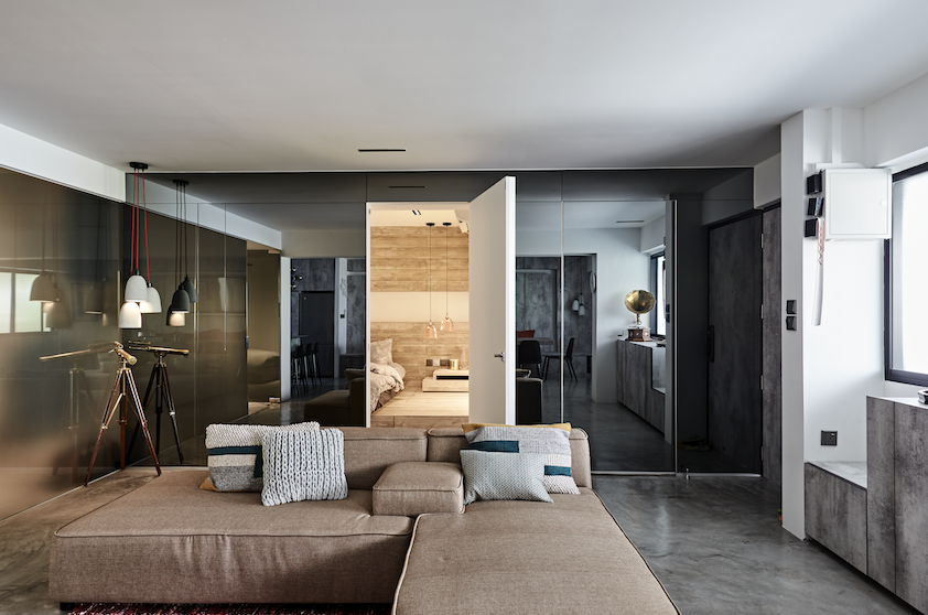
The homeowners, hedge fund manager Raphael Foo and writer-director Annette Lee, love to play host. (You might recognise her as Sue-Ann in social media website Sgag's humorous videos). They also wanted a space they could work in and be creative. One minor challenge they had to overcome, though, was their different design preferences.
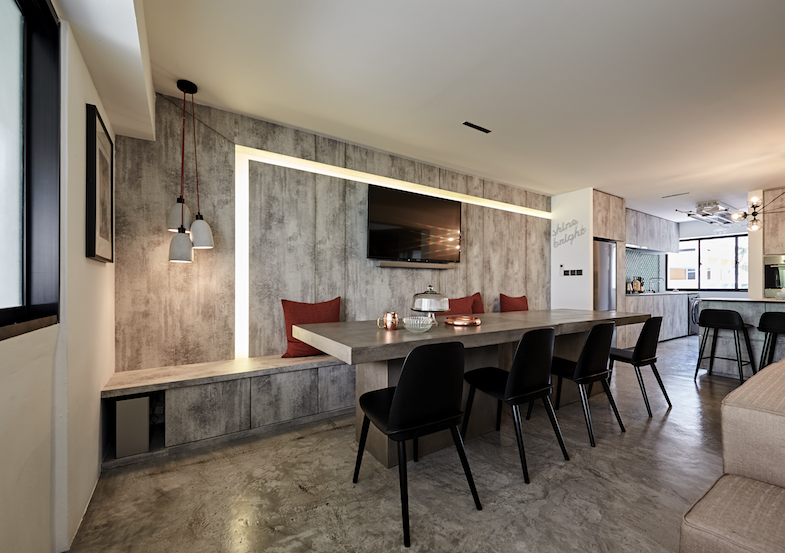
"While Raphael is into clean lines, metallic finishes and contemporary design, I like an industrial and vintage look with pops of colour," says Annette. They engaged Studio Zync to bring the styles together. They spent a $100,000 on both renovation and furnishings. It includes the total reconfiguration of the home and creating a concealed effect with the bedroom doors.
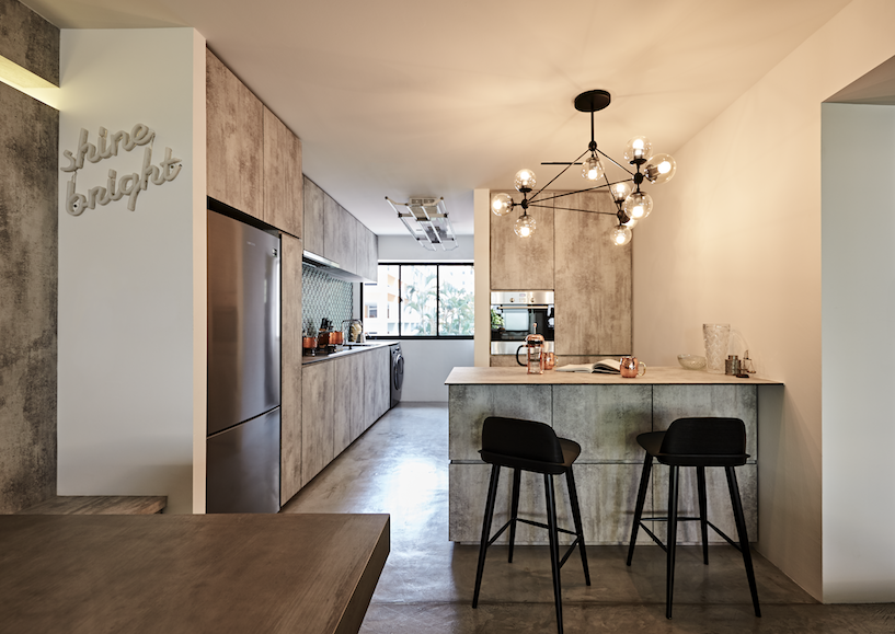
"Raphael likes "secret" doors, not only for the surprise element but also to create a space that looks neater. The seamless effect was complemented by handleless kitchen cabinetry and hidden storage; there is storage under the built-in dining bench, below the breakfast counter, and in the platform bed," shares Annette.
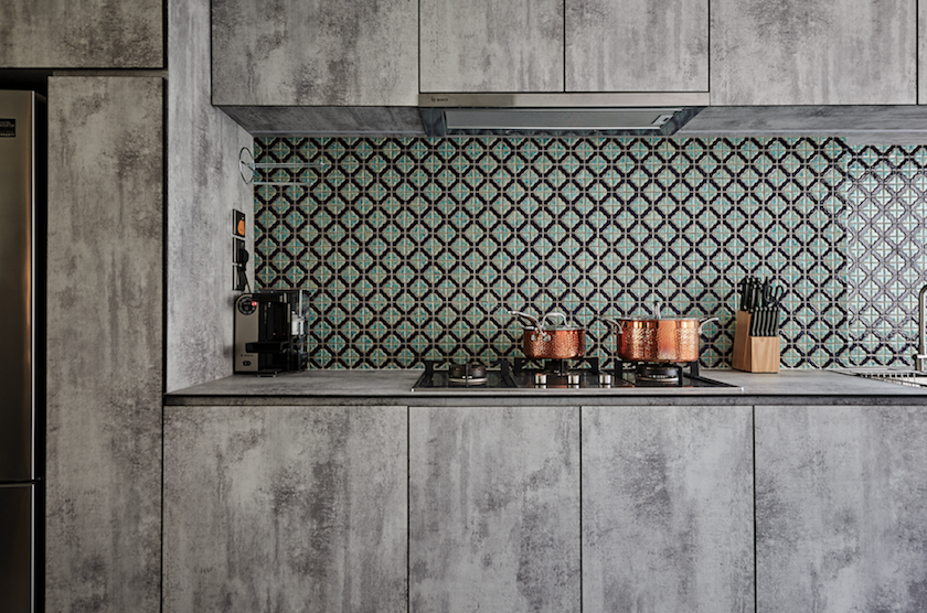
Annette wanted a pop of colour in the kitchen, so they looked for interesting tiles from shops in Balestier. On her collection collection of knick-knacks, she says: "It is mash- up of things we like; the quirky, handmade items are mine, whereas the more posh and sleek pieces are his."
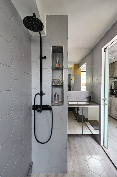
The grey hexagonal tiles are a good match with the concrete screed floors in the living room and kitchen. And, can you spot the pop of yellow here?
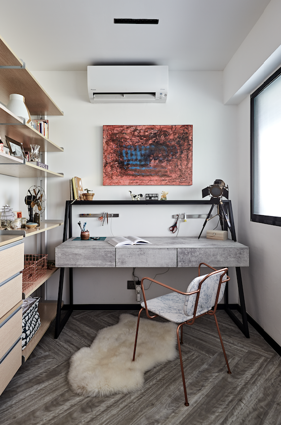
On weekends, Annette would have a cuppa before retreating to her study for a quick pilates session. The study is also a space for their books, camera equipment and some knick-knacks.
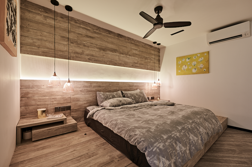
Despite the drop ceiling and platform bed, the bedroom still feels spacious, thanks to the horizontally placed laminates which visually elongate the room. "We not only made the guest room smaller - to make space for a longer master bathroom - but merged the store room with the master bedroom, too; the latter made space for a walk-in wardrobe," she shares.
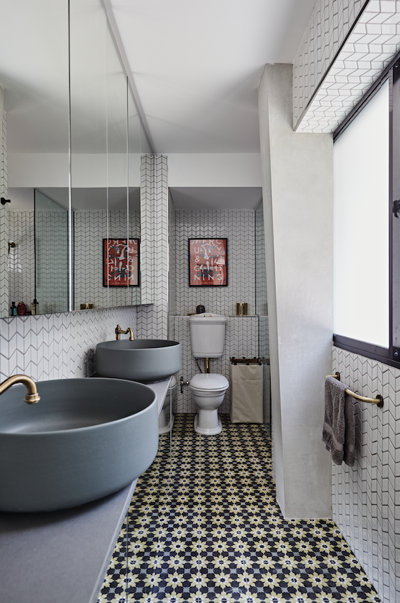
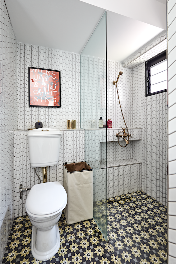
After taking some space from the guest room, the designer was able to create this long vanity counter with double sinks. The bright and airy bathroom is Annette's favourite space. They shopped for antique-style toilets and brass shower fittings at a bathroom furnishings warehouse.
"Our designer chose Danish and Scandinavian-style elements, like the dark wood dining chairs and light wood vinyl in the bedrooms, to complement some vintage elements. The final look is something that allows us to layer easily, especially with cushions, rugs and paintings. Credit goes to my designer, too, who managed to keep the number of bedrooms and bathrooms and left no dead space," says Annette.
This article was first published in Home & Decor.
ALSO READ: Pink, fresh & functional: A couple's not-so-typical HDB flat