Make the most of your 5-room HDB with fresh layout ideas

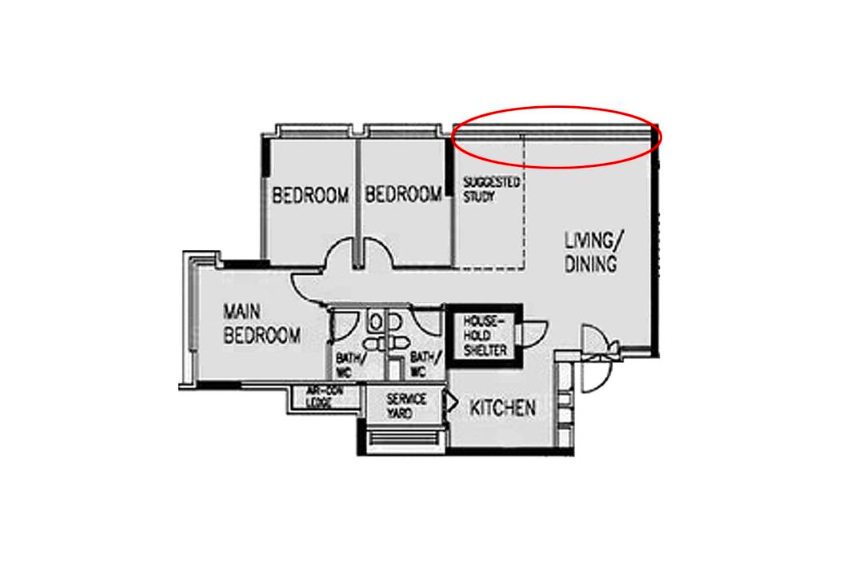
From household shelters to suggested studies, there's little difference in the layout of 5-room flats. Still, what adjustments can you make to refresh your space?
Turns out, there are plenty of tweaks you can make to change up the make-up of your house. From knocking down walls, applying treatments and room transformations, there are plenty of fresh layout ideas to take away from these five 5-room HDBs!

Interior Firm: Stylemyspace
1. REFORMATTING THE FLOW OF YOUR HOME BY TAKING DOWN WALLS

Though 5-room flats already offer a much bigger floor space to work with, there are a few tweaks that you can make it even more spacious. Doing away with a bedroom, this home by ELPIS Interior Design makes way for an extensive entertainment centre. Then, a similar treatment was done on both the walls and floor to ensure a seamless transition between the spaces.


That's not all though - many of its fittings and fixtures add to the illusion. Take for instance, the reflective surfaces attached in the extended study area, glass doors that overlook into the kitchen, galley-style full-height cabinets and nifty nooks that play home to bulkier furnishings such as the bed and fridge. The end result? An expansive looking space with plenty of breathing room, enough to call the place a private haven!


Interior Firm: ELPIS Interior Design
2. HAVE A SEPARATE WET AND DRY KITCHEN AREA

If you cook frequently or just think that open concept kitchen is so passe, try separating your wet and dry zones like this Lemonfridge Studio abode instead!


Here, the bulkier appliances like the fridge, microwave and coffee machine have been given a new home - sitting snug in recesses of the customised built-in cabinetry in the extended area. This shift not only opens up more work space in the wet kitchen area but also allows the homeowners to keep these hosting essentials close at hand!

That being said, even the wet kitchen wasn't overlooked in this makeover. The space is kept bright and airy with a set of glass windows and doors that doubles as a barrier to contain the less than pleasant cooking fumes.


Interior Firm: Lemonfridge Studio
3. RETHINK YOUR BEDROOM SPACES

It's time to rethink your bedrooms, just like how Style Living Interior reimagined the interiors of this Ang Mo Kio flat!


Aside from turning one of the junior bedrooms into a walk-in wardrobe/vanity area (by partially knocking down a wall), the master features a rather unconventional layout too. Instead of having the bed rest against the wall, it's nestled next to the windows, which offers a touch more privacy in this newly enlarged "open concept" bedroom.

But the designers didn't just stop at one revamp - the other bedroom is now a mini lounge area, complete with soft furnishings and bi-fold doors.


Interior Firm: Style Living Interior
4. REINTERPRET THE COMPACT JAPANESE STYLE TO CREATE AN AIRIER ABODE

Japanese homes are best known for being compact but what if you have a bigger space to work with?


Well, D5 Studio Image manages to combine both, creating an abode that's not just airy and expansive but also offers a fresh design approach! Think a galley style open concept kitchen, raised platforms, built-ins and a generous headboard that spans the length of the bedroom. All of these additional pieces are all cleverly flushed to the sides, making the space look even bigger.


Interior Firm: D5 Studio Image
5. CHANGE OUT THE SUGGESTED STUDY FOR A COSY NOOK!

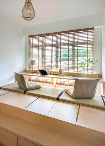
Forgoing your study area may seem counterproductive at first but once you do away with it, it opens up several possibilities. Stylemyspace turns it into an opportunity to include an expansive dining set plus sofa, for one.


To really utilise the enlarged space, the designers also turned a small section of the living room into a cosy nook, demarcating the space with a pop of soothing blue and a small raised platform complete with soft furnishings and blinds that provide ample shade when unfurled!


Interior Firm: Stylemyspace
This article was first published in Qanvast.